Another Spot of Photoshopping
ktuli — Sat, 10/09/2010 - 10:42
Alright, we'll take a little break from the bees and flowers and take another look at some more recent photoshopping work.
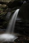
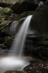
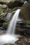
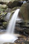
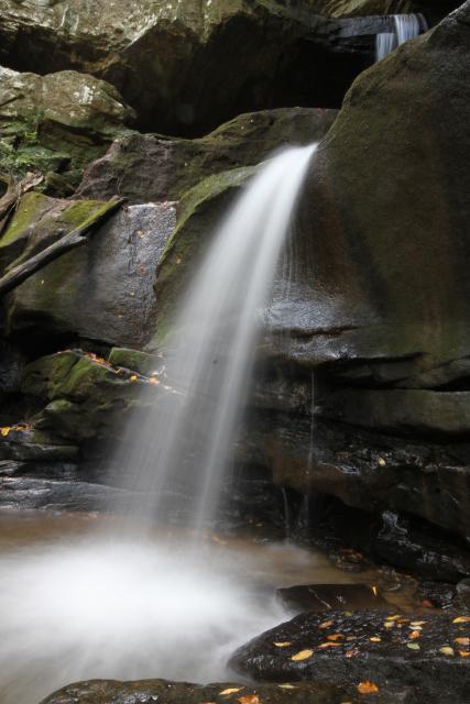
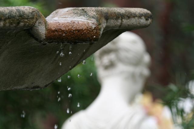
I shared this photo once before, and while I really like the photo, it needed a few very minor touch-ups to be ready to for the Photographic Section's Digital Projected Image Competition.
If you hover your mouse over the image, it will show the original. You'll see that all I did was use the spot healing tool to clean up the water spots and a single rust spot. While those spots weren't necessarily distracting in the original, I think you'd have to agree that removing them certainly makes the shot much nicer.
If you're interested in more discussion on this photo, head on over to the original post.
- Bill
Bees and Flowers (part 2)
ktuli — Thu, 10/07/2010 - 20:47
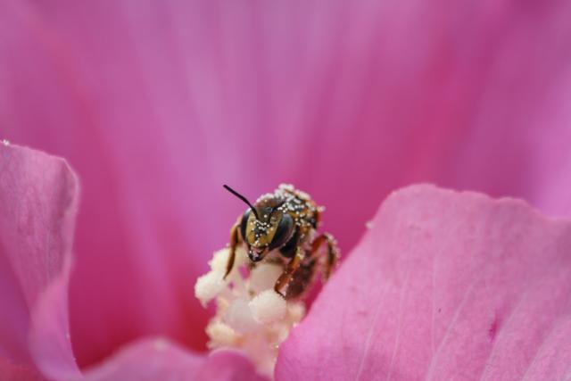
Alright - here's day two of the bees and flowers.
Technical Data: Canon EOS Digital Rebel XT, Tamron 180mm f/3.5 Di SP LD 1:1 Macro, 1/800 sec at f/3.5. ISO 400. No post production. Taken in our own backyard.
What Works: The focus is tack sharp on the bee's face. The macro lens really does a great job of magnifying the subject - you can even make out single grains of pollen (apologies if that makes your allergies act up). The foreground petals of the flower do a great job of framing the main subject.
What Doesn't Work: I could have used a smaller aperture to get a slightly deeper depth of field and get the entire bee in focus. Perhaps a catch-light in the closer eye would have been a nice finishing touch.
- Bill
Bees and Flowers (part 1)
ktuli — Thu, 10/07/2010 - 10:05
Well, summer has officially been over for a couple weeks now, and the weather is quickly following suit. Which means that sights like these are all but over for a while.
Fall is probably one of my favorite seasons - the cooler weather is more conducive to outdoor activities, hockey season starts back up, and the fall foliage is always a wonderful gift from nature. Since we had such a hot and dry summer, I don't know colorful of a fall we'll get this year, so I figured I'd let summer linger a little longer.
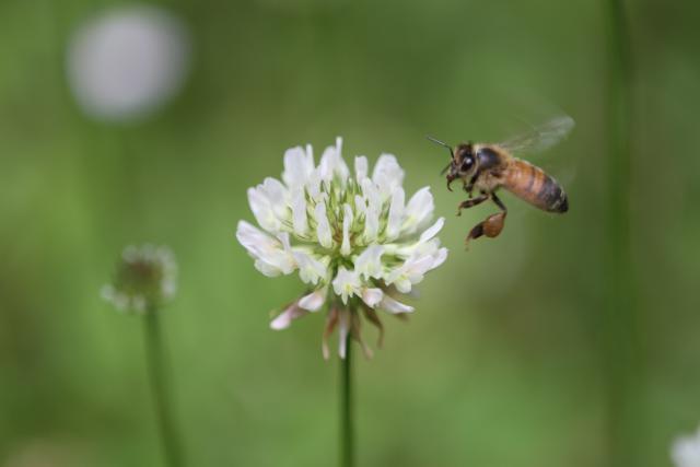
Technical Data: Canon EOS 7D, Tamron 180mm f/3.5 Di SP LD 1:1 Macro, 1/510 sec at f/3.5. ISO 200. Dolica AX620B100 tripod. No post production. Kanawha State Forest, Charleston, WV.
Why This Photo: I frequently try for photos of insects in flight, and after hiking around for about five hours this day, I decided to take a break by sitting in a field of wild flowers and waiting to see what would come to me.
What Works: The shallow depth of field (which is necessary to help get the fast shutter speed to freeze the motion of the honey bee and flowers in the breeze) produces a nicely blurred background. The focus is fairly sharp, though a bit blurred on the bee itself - whether from missed focus or from motion blur. The catch-light in the bee's eye is a nice touch.
What Doesn't Work: The composition is a bit bland with the flower at the dead center of the photo, perhaps a post production vertical crop would convert this to a more functional photo.
I have a handful more flower and bee photos, so I'll get around to sharing them sooner or later.
- Bill
Kanawha State Forest Spider: Redux
ktuli — Mon, 10/04/2010 - 16:01
If you have been following along, you know that I am not big on photoshopping my photos very much. Partially this is because I'm a purist and would rather get the "perfect" shot right with the camera, partially because I generally feel I do a bad job when trying to use Photoshop, and partially because I really hate poorly and obviously photoshopped images.
But the other day, I was able to take one of my all-time favorite photos I've ever taken and make it better with several small adjustments with Photoshop Elements.
The photo in question is one in a set of photos taken of a cool looking spider we had found in Kanawha State Forest near Charleston, WV. I debated saving this modified version to discuss sometime in the future when I needed a post to get me going, but between the good results I got and really liking the nice mouseover trick I found recently, I just couldn't wait.
 |
Original Image | 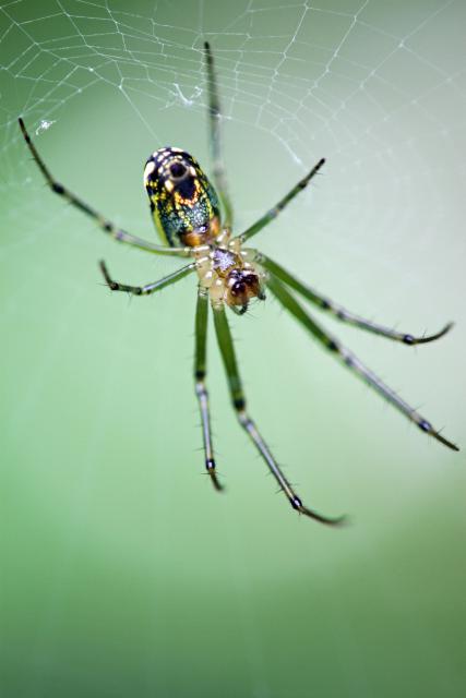 |
 |
Auto Adjusted | |
 |
Spot Heal tool on thorax to remove hotspot. Darken highlights 50% on abdomen. | |
 |
Clone Stamp tool used to touch up leg that touched right edge of frame. |
As you can see, the adjustments are very minor, and if you didn't know they happened, you probably couldn't even tell. Heck - some of them, you'll probably have to look very closely to see the difference between the two images when they're displayed even like they are here (I find myself sliding my mouse back and forth over the thumbnails to have the change flip back and forth on the larger image). But to me, that is a successfully photoshopped image - one where you can't even tell that photoshop was used.
I am submitting this photo to an upcoming Photographic Section digital projected image competition, so we'll see how my minor adjustments do. I with I could submit both photos and see which one scored better to see whether the edits were worthwhile.
Regardless, I managed to take one of my favorite photos and make it that much better. I'm glad I didn't have this one printed and framed yet, because it definitely would have to be redone with this new version!
- Bill
Rough Morning on the Water
ktuli — Sun, 10/03/2010 - 22:08
I could use a morning spent like this... choppy water or not. What do you think?
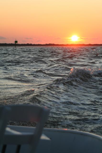
This photo was taken around this time two years ago on an early morning fishing trip on the Outer Banks in North Carolina. This used to be a favorite and regular vacation spot for us, but we haven't been there recently.
Technical Data: Canon EOS Digital Rebel XT, Canon EF 80-200mm f/4.5-5.6 II at 80mm, 1/800 sec at f/5. ISO 400. No post production. Cape Hattaras, NC.
Why This Photo: We were out on the boat before sunrise, so as the sun came up over the horizon, I clicked of a round of photos. On the rocking boat deck, most were throw-aways, but I did bring home a couple keepers. We brought home some fish for dinner too.
What Works: The composition uses the rule of thirds with the horizon on the upper third, and the boat deck chair reaching to the bottom third. Additionally, the sun and the prominent wave hit on the right third. The warm sunrise color is a beautiful contrast to the cool blue water. The crisp focus hits right on the whitecap of the wave, and probably most surprising to me is the horizon is actually level!
What Doesn't Work: I unfortunately was at the widest focal length of this zoom lens, and I couldn't really back up, but it would have been nice to have gotten more of the boat in the shot to make it more obvious that the shot was taken from the boat - perhaps a lower angle would have worked. Also, a deeper depth of field might have been nicer - with the full sunlight into the shot and the fast shutter speed (1/800th sec), I could have used to crank up the f/stop (except I didn't even know what an f/stop was back then).
So I could use another morning like this... both to get another chance to make another photo better, and just because it would mean I was on vacation. And I could certainly use both of those things.
- Bill
Time Spent at the Falls
ktuli — Fri, 10/01/2010 - 18:58
Ok - hopefully I can keep my promise from my last post and provide something a bit more appealing today.
Not too long ago, I took a trip up to McConnell's Mill State Park. I really love going to this park, but honestly, I get mixed results with my photography there - I never know whether I'll come back with stuff I like, or a whole card worth of images to delete.
This trip, as I was driving there, I thought about what kind of photography I would like to do that day. Sometimes this works out and I manage to get exactly what I wanted, but more often than not I miss the mark altogether. Most days, I try to head out with no plan whatsoever and just capture whatever I can find. Both ways work, and I flip back and forth between them.
As I cruised up I79, listening to Lotus, I thought perhaps I should delve into HDR. And with that in mind, I decided to take multiple exposures of any shots I did.
Here's one set of results... (if you hover your mouse over one of the thumbnails, it will change the larger image, then you can slide along the row of thumbnails to see the progression in exposure - if it is the first time through, be patient as sometimes my server is a little slow and the image might take a moment to load).
Technical Data: Canon EOS 7D, Sigma 10-20mm f/4-5.6 EX DC HSM AF at 16mm, 1.3, 2, 3.2, 5.2, 8, 12, 21 sec respectively at f/28.1. ISO 200. Dolica AX620B100 tripod. No post production. McConnell's Mill State Park, Lawrence County, PA.
So for the most part, a lot of those images don't really work by themselves, but the hope is that I can eventually run these through some HDR processing and get a super image out of them.
If you're unfamiliar, HDR works by taking a set of differently exposed images and merging them into a single image with a much greater detail by including a high dynamic range of sensitivity from the darkest to lightest details. Our eyes naturally can see a much wider range in sensitivity to light than our cameras can, so using a post production process like this is the way around that limitation.
I'll be honest, I've never done any HDR work before, so hopefully this works and then I'll eventually share the final product here.
Thanks for stopping by, leave a comment and let me know what you think of these photos or any experience you have with HDR.
- Bill
Turtle with Hot Spots
ktuli — Thu, 09/30/2010 - 18:46
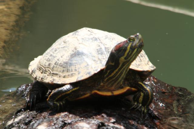
Sometimes, it helps to look at bad photos in order to learn from them. Today's photo is definitely a bad photo.
Specifically, this photo suffers from some terrible hot spots or "blown out" exposure. Basically this is what happens when white areas of the photo lose detail. This happens when you either over expose the photo by leaving the shutter open too long, or by having the wrong white balance set, or most likely when you have the wrong metering mode selected.
Technical Data: Canon EOS 7D, Sigma 150-500mm f/5-6.3 APO DG OS HSM with Kenko Teleplus PRO 300 "DG" AF 2x Teleconverter at 1000mm, 1/50 sec at f/18.2. ISO 200. Dolica AX620B100 tripod. No post production. Kanawha State Forest, Charleston, WV.
Why This Photo: While wandering around Kanawha State Forest, I noticed several turtles in the pond. Periodically they would crawl out on a log to bask. Since any of the shots of the turtles swimming were coming out even worse, I wanted to get one of them out of the water.
What Works: Honestly, not much. The framing is probably the nicest thing, with the turtle's slightly turned head showing off the colors on its head and neck.
What Doesn't Work: Just about everything else. The focus is off leaving most of the photo slightly blurred (possibly from the use of the teleconverter), and there are distracting elements all over the place. However, by far, the worst element is the fact that almost the entire carapace (shell) of the turtle is completely blown out.
Granted this turtle's carapace was pretty muddy, so you couldn't make out much in the way of color, but they are so intricately patterned and textured, that it is extremely unfortunate to lose all that detail. There are some hot spots on the log as well, but the photo is already lost.
This photo was shot almost at noon in late May, so the sun was high in the sky and obviously pretty strong (the turtles were using it to warm themselves). This is probably one of the worst times to be shooting on a sunny day. Had the weather been overcast, this photo would have probably come out very different (though the colors may have been muted).
Other than waiting for the sun to go away, or wishing for different weather patterns, there are a couple things I could have quickly used to find out that I was taking bad photos. Specifically, I could have used my camera's highlight alert or histogram features, but we'll save those for another day.
If I had used one of those features or simply been paying more attention, I could have easily fixed this problem. I could have checked what my camera was using for its exposure, and then manually "under" exposed the image to eliminate these hot spots by either using a faster shutter speed or using the same shutter speed but with a narrower aperture (which actually would have also increased my depth of field to capture more clarity along the entire length of the turtle).
Remember - you probably wouldn't want to frame your bad shots, but sometimes they're good to keep around to review and remind yourself of things you need to pay attention to in order to get better photos.
Thanks for stopping by today! I'll try and find a more pleasing photo to look at for next time.
- Bill
Depth of Field: Frog
ktuli — Wed, 09/29/2010 - 19:23
Alright, I'm sorry about being such a slacker with the posts recently, but between my photography class, and going to a Penguins game, I haven't been home a single evening this week yet.
Anyway, I thought maybe we'd take a look at depth of field. Depth of field in still photography is controlled with the aperture and is defined as the portion of the photo that is acceptable sharpness (not to be confused with focus).
Aperture on your camera is set in f/numbers - a small f/number provides a wide aperture, and a large f/number provides a narrow aperture. I know - it is confusing, but something I've found that makes it easier to understand is to think about it in terms of depth of field. If you select a small f/number, you will get a shallow (small) depth of field. Inversely, if you select a large f/number, you will get a deep (large) depth of field.
But this is much easier to see with examples...
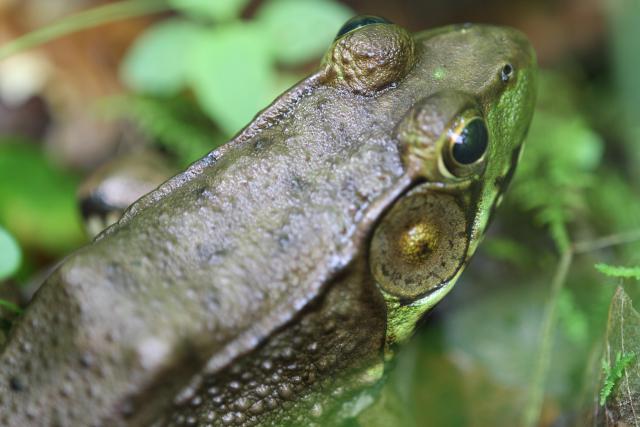
Shallow Depth of Field Technical Data: Canon EOS 7D, Tamron 180mm f/3.5 Di SP LD 1:1 Macro, 1/3 sec at f/3.5. ISO 200. Dolica AX620B100 tripod. No post production. Kanawha State Forest, Charleston, WV.
Notice how the frog is in acceptable sharpness (but technically not tack sharp focus if you look very closely) and the background is pleasantly blurred background as I've mentioned on many other posts.
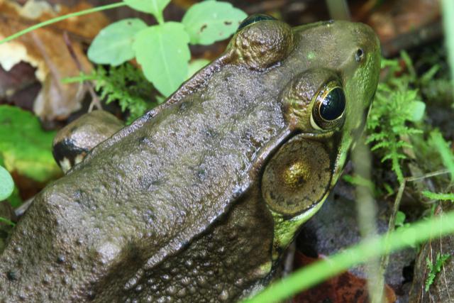
Deep Depth of Field Technical Data: Canon EOS 7D, Tamron 180mm f/3.5 Di SP LD 1:1 Macro, 8 sec at f/18.2. ISO 200. Dolica AX620B100 tripod. No post production. Kanawha State Forest, Charleston, WV.
Here, you'll notice that almost everything is in acceptable sharpness. You can see the detail in the leaves and plants around the frog. In fact, if you look closely, even the texture of the frog's skin is more detailed. However, the blades of grass in the foreground are starting to become distracting with this depth of field.
There are different reasons and different situations that contribute to why you would want to use either shallow or deep depth of field. Sometimes, you can use a shallow depth of field to eliminate some distracting background elements. Other times, you will want a deep depth of field to keep as much of the photo discernible and acceptably sharp.
I also have another set from this frog illustrating some different depths of field...
I also did a couple photos showing the aperture range of the Tokina 35mm macro lens I recently purchased. And a long while ago I did another similar write-up discussing depth of field, but it didn't have photos to compare and contrast.
Hopefully these multiple sets of photos help to illustrate depth of field so you can try it out with some photos in the future.
Leave a comment and let me know whether this made sense or if I should try again...
- Bill
Hockey Cropping
ktuli — Wed, 09/22/2010 - 19:57
Well, after a power outage right when I was coming home from work that threw off my schedule for a bit, I'm now sitting on the sofa, relaxing and listening to the first preseason Pittsburgh Penguins hockey game. If you know me, you know hockey is something very important to me - both watching and playing it.
The return of the hockey season is something I've been looking forward to since May 12, 2010. It was big enough that it inspired me as to what to post this evening.
So I looked through my old photos, and I found a set of photos I took three years ago to the day. Oddly enough, it was also a preseason game against the Detroit Redwings.
These shots were taken at the Mellon Arena (which I will always know as the Civic Arena), and I managed to sneak in my Rebel XT with the Canon EF 80-200mm lens attached. Technically, the Civic Arena had a policy that lenses had to be no longer than three inches in length. And unfortunately, the Consol Energy Center has a policy that prohibits all cameras with interchangeable lenses.
As a result, tight photos from a fan's seat might be harder and harder to get. So you just might end up having to crop photos down to get nicer shots. Which is exactly what we'll look at today...
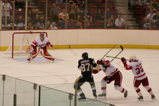
Technical Data: Canon EOS Digital Rebel XT, Canon EF 80-200mm f/4.5-5.6 II at 100mm, 1/200 sec at f/5. ISO 400. Cropped in post production. Mellon Arena, Pittsburgh, PA
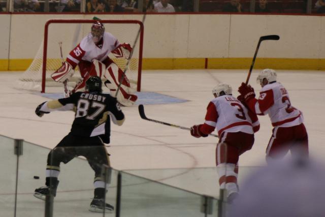
Technical Data: Canon EOS Digital Rebel XT, Canon EF 80-200mm f/4.5-5.6 II at 100mm, 1/320 sec at f/5. ISO 400. Cropped in post production. Mellon Arena, Pittsburgh, PA
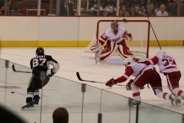
Technical Data: Canon EOS Digital Rebel XT, Canon EF 80-200mm f/4.5-5.6 II at 100mm, 1/200 sec at f/5. ISO 400. Cropped in post production. Mellon Arena, Pittsburgh, PA
If you mouseover the images, it should load the original, giving you an idea of how much the cropping cleaned up the final product. I probably could have used some effort to remove more distracting elements from the second and third images, but I was just doing a quick crop on these images.
So remember - even if you don't have that super-long telephoto, or you just want to leave your original composition a bit loose so you don't leave out important elements by cropping too closely on your actual shot - especially when shooting quick moving action, you can always go back later and crop things down a bit to get that close shot you're looking for.
Leave a comment and let me know what you think. What is your opinion of cropping in camera versus in post production.
Now, if you don't mind, I'm going to listen to the rest of the game... GO PENS!
- Bill
Freezing Water Drops
ktuli — Tue, 09/21/2010 - 20:33
Ok, so I had a discussion recently about just how fast of a shutter speed you need to set to freeze moving water. So I decided to dig out these photos. Anya took these at Phipps Conservatory.
Technical Data: Canon EOS Digital Rebel XT, Tamron 180mm f/3.5 Di SP LD 1:1 Macro, 1/400 sec at f/5. ISO 400. No post production. Phipps Conservatory.
What Works: The droplets of water are nicely frozen, and excellently placed on one of the thirds. The light reflecting in the drops provides nice highlights that draw the viewers eyes quickly to them as the main focal element of the photo. And finally, the nicely softened background from the fairly wide aperture offers a hint at the stature behind the fountain without it being a distraction.
What Doesn't Work: The floating fountain is somewhat disturbing, providing just a small portion of the fountain base along the left edge of the frame would anchor the photo more. Also, the convergence of the fountain and the statue's head could have probably been fixed at the same time by repositioning slightly. There also is a very slight amount of camera shake from the shot being done handheld (because Phipps has a policy against tripod use)
And just because I feel like it, we'll look at two photos today, so here's the second...
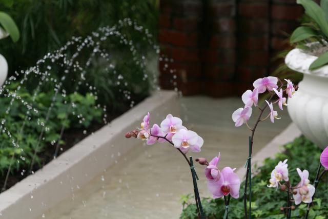
Technical Data: Canon EOS Digital Rebel XT, Tamron 180mm f/3.5 Di SP LD 1:1 Macro, 1/500 sec at f/5.6. ISO 400. No post production. Phipps Conservatory.
What Works: This shot does an opposite view from the one above, here the water drops become the background element, and let the orchids take the foreground focal element. The diagonal lines of the fountain base provide a nice offset in the image (diagonal lines are usually pleasing for whatever reason).
What Doesn't Work: The main thing that I don't like about this photo is the small bit of the flower pot encroaching on the left edge of the frame. With it being bright white, it is not able to be ignored.
Anyway - back to what started today's discussion, the shutter speed necessary to freeze water drops. Granted these water drops aren't exactly moving at the speed of bullets, but the exposures settings used are not pushing the boundaries of what the camera could do by any stretch of the imagination.
Should Anya have needed to freeze the motion more, she could have used a wider aperture, which would have allowed for an even faster shutter speed. Additionally, at ISO 400, she could have possibly increased that slightly to also allow for even faster faster shutter speed. And on top of all that, she could have also used flash to help provide additional light to freeze the motion.
The bottom line is that freezing motion like this is much easier than you might think. Give it a shot sometime and see what you can get.
- Bill

