Vroom vroom! (part 5)
ktuli — Sat, 08/21/2010 - 11:25
Alright last day of car photos (at least for a little while) - I have a stack of nature photos to get back to, so soon enough we'll be back to the bug eyes and frogs and other fun stuff you've come to expect from me.
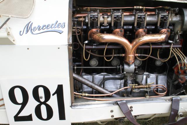
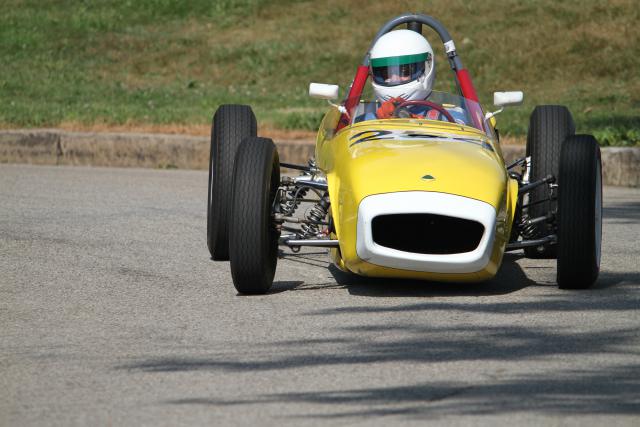
Towards the end of the day I spent at the PVGP, we wandered up to the paddock area where the drivers are able to work on their vehicles between races. Most of the photos I took up there didn't turn out as well as I would have liked, but this one turned out nice. Oddly enough, my father-in-law took an almost identical shot.
Technical Data: Canon EOS 7D, Canon EF-S 18-55mm f/3.5-5.6 II at 57mm, 1/25 sec at f/14.1. OS Mode 1. ISO 200. No post production. 2010 Pittsburgh Vintage Grand Prix Car Show, Pittsburgh, PA.
There's just something cool about that engine, I guess.
If you haven't seen them, I'd recommend checking out the other posts in this set (part 1, 2, 3, and 4).
Remember - the whole point of this exercise was to challenge myself to try something new. Whether or not I managed to get great shots wasn't the most important part, but coming away with some photos I really liked is a nice bonus.
So get out there and try something new, you might just surprise yourself and find something new that you enjoy!
- Bill
Vroom vroom! (part 4)
ktuli — Thu, 08/19/2010 - 17:11
Well, since this is still my favorite shot of the whole set, I figured I should give this one a bit more time...
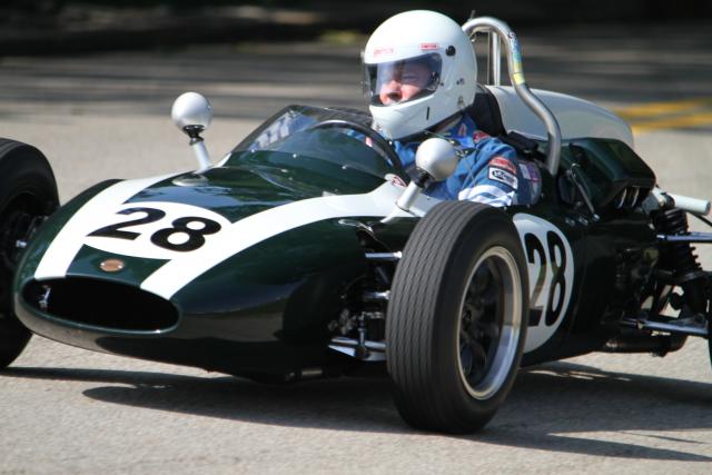
Technical Data: Canon EOS 7D, Sigma 150-500mm f/5-6.3 APO DG OS HSM at 500mm, 1/510 sec at f/6.4. OS Mode 1. ISO 200. No post production. 2010 Pittsburgh Vintage Grand Prix Car Show, Pittsburgh, PA.
Why This Photo: Like I've said in the previous posts, I was out this day trying a new photography. At this point, I was standing at the top of a curvy hill and then a sharp right turn. I was working on tracking moving subjects.
What Works: I like the close zoom on this shot, capturing the look of concentration on the driver's face. The reflections and shine on the car, and the nicely blurred background. Like some of the other shots I shared previously, I think this one also captures a sense of the action of the race.
What Doesn't Work: There are basically two things I wish were different about this photo - first, I don't mind the car not being entirely in the shot, but I wish that at least a portion of the rear wheel was in the shot to give it a little balance (perhaps I should try cropping in from the right to remove the rear suspension). The second is that the depth of field is a bit shallow so that the driver's face is slightly blurred.
All-in-all, even with its flaws, this is still my favorite shot from this set. It doesn't come close to being a prize winning photo, but considering it has gotten me into thinking about other styles of photography, there's more value in it than just a single photo. But I still like it...
While we're at it, I guess I will share some of those other photos that I feel are a bit flat and lack that feel of action to them:
Feel free to comment on any or all of the shots today.
- Bill
Vroom vroom! (part 3)
ktuli — Wed, 08/18/2010 - 17:31
Ok - I want to shift gears a little here (haha! yes, I know just how punny I am!).
So while I was out trying new photography, I went full bore and tried some artistic (or artsy-fartsy as I usually call it) shots of the cars. I have to be honest and admit that most of them looked terrible and didn't even make it off the memory card.
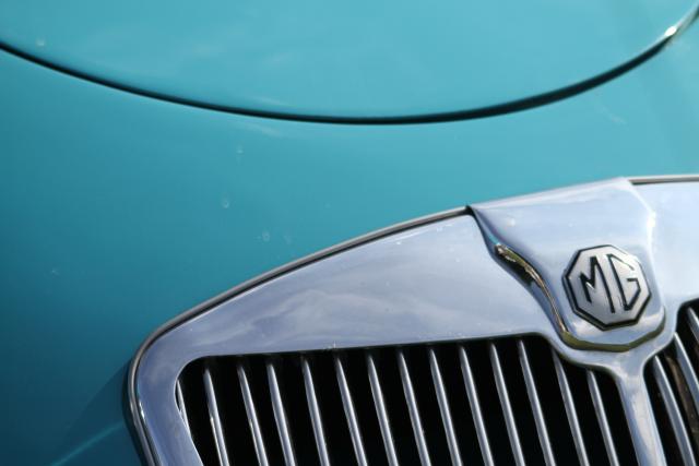
But I did get lucky with a couple good ones. This is my favorite of them:
Technical Data: Canon EOS 7D, Sigma 150-500mm f/5-6.3 APO DG OS HSM at 150mm, 1/1580 sec at f/5. OS Mode 1. ISO 200. No post production. 2010 Pittsburgh Vintage Grand Prix Car Show, Pittsburgh, PA.
Why This Photo: Like I've said, I was out pushing the envelope of my abilities and vision of my photography. I don't know much about these cars (though my father-in-law was there and a great source of information so I learned a little), but every once in a while I managed to see something in the viewfinder that looked good, and I guess I don't need to know too much about the cars to do that.
What Works: The framing of the shot really hits the mark if you ask me, and to be honest it was a bit of luck - I still had the Sigma 150-500mm lens on, so the 150mm focal distance kind of forced the composition.
What Doesn't Work: I probably should have tried a slightly smaller aperture to get more depth of field, or at the very least, made sure that the MG emblem was the point of critical focus.
What I'm Not Sure About: I kind of like the sunburst reflections on the metal grill of the car, but they are also washed out, so I can't decide if they detract from the photo or not.
Again - I think the main lesson here is to try new stuff and see what you can manage. Sometimes you'll surprise yourself, and maybe find something new you like.
- Bill
Vroom vroom! (part 2)
ktuli — Tue, 08/17/2010 - 19:13
No - you're not seeing double.
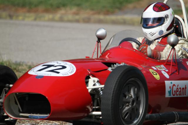
I managed to capture these almost exactly identical images of two different racers, which is quite impressive (at least to me) when you consider that I was shooting handheld for a good portion of the day. The shots were taken only five seconds apart, but if you look very closely at the background, you'll see the shots are slightly different.
Normally, I would have recommended using a tripod shooting at such a long zoom length (439mm), but my Sigma 150-500mm f/5-6.3 APO DG OS HSM has that lovely little Optical Stabilization feature, so I was able to shoot by hand.
Technical Data: Canon EOS 7D, Sigma 150-500mm f/5-6.3 APO DG OS HSM at 439mm, 1/1020 and 1/790 sec (respectively) at f/6.4. ISO 200. No post production. 2010 Pittsburgh Vintage Grand Prix, Pittsburgh, PA.
I think I'll pass on doing my normal full critique of these two - mostly I'm just liking how cool these two photos turned out. Even though some of the cars are cut off in both photos, I still like the composition of the shots - I think it helps to give the sense of motion like the previous shot. Feel free to post your own critiques in the comments if you like.
Fun stuff.
- Bill
Vroom vroom! (part 1)
ktuli — Mon, 08/16/2010 - 20:04
Well, as promised, I've finally uploaded new photos after getting my home internet connection fixed (talk about a fiasco and a half!). I have some really good photos, but I am going to try and run through them in order.
Which takes us back about a month to the 2010 Pittsburgh Vintage Grand Prix. I posted a teaser back then, and I have a few more to share.
Technical Data: Canon EOS 7D, Sigma 150-500mm f/5-6.3 APO DG OS HSM at 370mm, 1/1020 sec at f/6.4. ISO 200. No post production. 2010 Pittsburgh Vintage Grand Prix, Pittsburgh, PA.
Why This Photo: I sometimes try my hand at new styles of photography. This is one of those times - just stepping out of my comfort zone.
What Works: The best thing about this photo is the lean that the racecar has from hitting this turn. I feel it gives the photo a sense of the action. Most of the other shots I took that day seem too static.
What Doesn't Work: I'm not thrilled with the shadow from the tree right in front of the car - it is a bit distracting. Focus might be a tad off too.
There's more from this set, so tune in again soon for more. In the meantime, drop me a line and let me know what you think of these car photos.
- Bill
Poll: Punta Sur: Horizontal or Vertical?
ktuli — Thu, 08/12/2010 - 19:56
Ok - still no luck with getting our internet connection fixed up at home. Comcast is already annoying me, and they haven't even even installed yet - but then again, that's why they're annoying me. Which means I have five sets of photos waiting to upload, so you'll have to bear with me a bit longer here and wait for the Vintage Grand Prix photos as well as some photos I took for Anya's Card Blog, and of course more nature photos.
Anyway.......... I am going to switch gears a little and make a post specially for my mom. Today she asked me why I had so many weird photos on the site recently, and actually called my cactus photo from the other day "a little creepy". I'm not quite sure what she meant by that, but she asked for more landscapes or "cute baby" photos (ie: my six nieces and nephews - her grandchildren). Well, I'm not so big on the baby photos - heck, I'm not even that big on any kind of portraits. But I do work in some landscape stuff from time to time. So here you go, mom...
Technical Data: Canon PowerShot SD800 IS Digital Elph at 4.6mm, 1/320 sec (horizontal) and 1/250 sec (vertical) at f/7.1. ISO Auto. No post production. Punta Sur, Cozumel, Mexico.
So we'll ignore some of the technical errors with these photos - like the sloping horizons - and just focus on the orientations. Do you like the horizontal or the vertical view better?
Either way, I wouldn't mind another trip to Cozumel. There are some white sand beaches there (and even a small one in the photo), but usually the beaches are rocky as you can see at the bottom of both photos. But the water is crystal clear and bright blue, and the sky mirrors the bright blue water (or is it the other way around?). Either way, I'd love to take mom and the rest of my family on a trip to the beach, and I definitely wouldn't mind a scuba trip or three.
Anyone have any winning lottery tickets they're not going to use?
- Bill
New Lens: Tokina M35 Macro
ktuli — Wed, 08/04/2010 - 21:19
Normally, you wouldn't think of macro when you think of a 35mm lens, but that's exactly what got delivered to my door today.
This is a Tokina AT-X M35 Pro DX AF 35mm f/2.8 Macro 1:1.
I have been debating what lens to buy next, and to be honest, this lens wasn't really on the list until recently. There are many other (read: more expensive) lenses on the list, and because the budget is still pretty tight (need to save up for our Indonesia trip) I had to go with a less expensive lens. As I said, you don't normally think of macro photography with 35mm lenses, and that was part of what drew me to this lens. I had been looking at 60mm, 90mm, and 100mm macros from both Canon and Tamron.
But the deciding draw to this Tokina was its minimum focusing distance - a mere 5.5 inches. In messing with the lens just tonight after unpacking it, that means basically right up to the front of the lens. In fact, if I leave the lens hood on (which I will discuss shortly) literally is shorter than the lens!
So let's get down to some details about the lens... some pros and cons and interesting facts.
Price: This is certainly a budget lens, so we'll have to keep that in mind that this is not a Canon L-series lens. But at $309 at Adorama for their lens kit (which includes the lens, a UV filter, a lens cap leash, and a lens care kit) it is certainly affordable.
Size: The lens is small, and thus very portable. It weighs only 340 grams (almost 12 ounces), and is 60.4mm (about 2.4 inches) long at its shortest length (focused to infinity). So it will be an easy addition to my camera bag - which means it increases its chances of being used and not just left at home.
Construction: So far, the construction seems very sturdy - except for the AF/MF "switch" which I'll get into below.
Aperture: The lens has aperture ranges from f/2.8 to f/22 and uses 9 blades, which I haven't had a chance to test, but supposedly produces some really nice bokeh. I have the feeling that this lens will end up being a very nice portrait lens with its equivalent 52mm focal distance on my camera's APS-C sensor and the nice blurred backgrounds with the f/2.8 maximum aperture.
Focusing: Remember - we're talking about a budget lens here, so there's no hypersonic motor here, so AF is a little slow and a bit noisy. However, the lens doesn't take too long to seek and finds focus pretty well. There is a nice large focus distance scale display window which even provides info regarding the macro magnification ration info.
Additionally, the lens has a focus distance limiter switch - something I've never seen before. Basically the switch lets you select from the whole range (infinity to 5.5 inches) or break it into two sections with a break at about 0.55 feet (so infinity to 0.55 feet or 0.55 feet to 5.5 inches) - this feature will help reduce any lengthy seeking when by eliminating half the range if you don't need it.
However, the focusing system is where I have my only complaints so far. First, the AF/MF "switch" is actually the focusing ring. My Tamron 180mm Macro lens uses a similar setup, but I think because of the size of this lens, it misses the mark. Basically, you slide the whole focusing ring forward to select AF and back towards the camera to select MF. Unfortunately, where this feature is smooth and simple on my Tamron lens, it feels clunky and uneven on this Tokina lens. It sometimes sticks, and you can't flip between modes with a thumb, but rather have to carefully make sure to slide the ring evenly at all points along the circumference.
Additionally, messing with the lens tonight, I've found that if I slide through the focus range with the lens pointed up, it seems to catch and get hung up from time to time. I don't know whether it would damage it trying to use auto focus while pointing the lens up, but I think I'll avoid trying it. If the lens is pointed horizontally or downward (which is obviously the more common orientation) it is smooth and I have not noticed it catch once.
Accessories: This lens comes with only one accessory standard (I'm not discussing the bonus stuff I got with Adorama's kit) which is a small metal lens hood (MH-522). It threads into the lens like a filter, and if you don't know to look for it, you'll likely miss it. I honestly am not sure if this lens hood is necessary as the front element of the lens is pretty deeply recessed in the lens to begin with.
Other: Lastly, I don't know exactly what to say about this, but if you use Canon SLRs, you know that they use a white square to indicate the mount point for EF-S lenses and a red dot for EF lenses. This lens has a white dot on the barrel and a red dot on the flat part that sits flush to the camera. I'd say this is very odd, but interestingly enough, my Sigma 150-500mm lens has a red dot on the barrel and a white dot on the lens end. Weird.
All in all, I'm fairly pleased with this lens so far. I wandered around the house trying to decide what to take photos of to test with, and hopefully those matchstick photos work. But the truth of the matter is that the proof will be in the pudding, and we'll see what kind of photos I can get with this lens out in the field, so stay tuned to see what I can come up with.
- Bill
In the Meantime: Cactus
ktuli — Tue, 07/27/2010 - 21:07
While I sort out what it going on with my internet connection at home, I am unable to upload new photos, so you have to wait for more 2010 Vintage Grand Prix. Which means more of my typical photography.
Today we zip over to the Franklin Park Conservatory in Columbus, OH. And as usual, look at more macro photography.
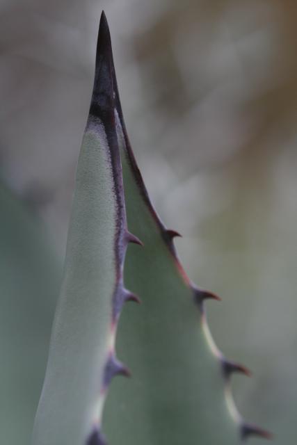
Technical Data: Canon EOS Digital Rebel XT, Tamron 180mm f/3.5 Di SP LD 1:1 Macro, 1/320 sec at f/4.5. ISO 400. No post production. Franklin Park Conservatory, Columbus, OH.
Why This Photo: There is just something about macro photography that draws me in. It causes you to look at something a little differently, and possibly see something you would normally not see, or pay attention to something you'd overlooked. And for whatever reason, that always applies with cacti for me.
What Works: The critical focus hits right on the mark with the center thorn of the cactus in tack sharp focus (yeah - I mean that pun!). The simplicity of the shot keeps my focus and draws me in without being too distracting. Finally, the macro angle allows you to see something differently - at times I look at this shot of a small cactus thorn and it honestly reminds me of a fossilized whale jaw that hangs on the wall at the Carnegie Museum of Natural History in much the same orientation as this.
What Doesn't Work: While the shallow depth of field produces a nicely blurred and non-distracting background, there is simply nothing at all discernible in the background and is at times a tiny bit confusing. Additionally, the depth of field is so shallow that the secondary thorns are blurred as well. And unfortunately, the colors are a bit muted - almost to the point of being a monochrome shot.
I also like the framing of the shot and the fact that I managed to avoid breaking the edge of the frame with the center point of the thorn (which is a very typical problem I have if you've been following along).
I also took another shot of these same cacti that encompassed a wider shot and more of the thorns, but I just can't decide whether I like it as much.
Drop me a comment and let me know what you think. Hopefully I'll have an internet connection working at home soon so that I can start uploading new photos, or you'll have to deal with a few more old photos... hope you won't mind.
- Bill
And Now for Something Completely Different...
ktuli — Sun, 07/25/2010 - 13:56
As I'm sure you've discovered by now, my favorite type of photography is macro wildlife, but something I try from time to time is to step outside of my comfort zone. So this weekend, I did just that and tried something new...
Unfortunately, Verizon has been utterly useless in fixing an issue I've had with our DSL at home for over two weeks now. So until I get a real working internet connection at home, you'll have to wait to see more.
- Bill
Resting Julia Butterfly
ktuli — Sat, 07/24/2010 - 21:53
Our last visit to Phipps was also to see what we could find at their Butterfly Forest.

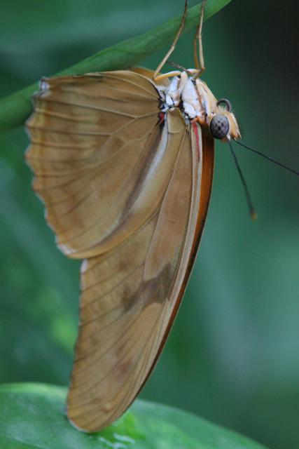
This Julia Butterfly (Dryas iulia) isn't necessarily the flashiest of butterflies. Even with its wings open, it is simply an orange butterfly as you can see to the right. However, when their wings are closed, they're even less spectacular.
But that doesn't make them any less interesting as a photographic subject in my opinion.
Technical Data: Canon EOS 7D, Tamron 180mm f/3.5 Di SP LD 1:1 Macro, 1/260 sec at f/6.4. ISO Auto. Canon Monopod. Phipps Conservatory, Pittsburgh, PA.
Why This Photo: Honestly, I was out specifically to take photos, and specifically out to take photos of butterflies, so...
What Works: Focus is sharp even with only using a monopod with the focus hitting right on the butterfly's eye and mouth.
What Doesn't Work: Framing is just a touch off with the one antenna and the feet of the butterfly break the edge of the shot, and the depth of field could be a bit deeper as the edges of the wings are not as sharp as they could be.
What I'm Not Sure About: I honestly can't decide whether I like the upside-down shot of the butterfly, and can't tell if this shot is interesting or just flat and boring.
Butterfly shots are tricky, but maybe that is why I keep trying them - I like the challenge, and I feel that once I can pull it all together and get that one perfect shot it will be all worth it. Is there a particular shot you keep trying for?
- Bill

