sculpture
Bali: Barong, Temple, and Elephants
ktuli — Thu, 02/10/2011 - 20:36
It looks like we're sticking with that vertical format for today's photos... I tend to try using that format often, but for whatever reason, I used it to great extent during the trip.
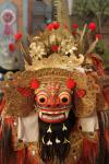
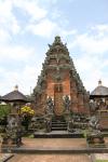
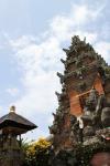
Today's set comes from our second and third days in Bali. First, we have a Barong costume. This was from a Barong Dance that we attended. Barong is the king of the spirits and protects Bali from evil. After the dance, we went to visit another temple - Pura Desa Batuan. Pura Desa Batuan is actually two separate temples, and the grounds have a great deal of statuary. We also visited several areas to see different Balinese crafts, but I'll save that for another day.
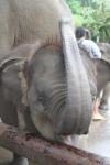
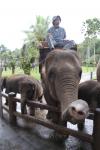
The third day, we visited the Elephant Safari Park where we got to ride an elephant through the jungle.
|
|
||
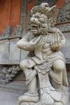
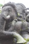
I like the feel of the photo of the statue (second from top on left), with the just slightly blurred background showing more of the intricate stone carving without being distracting, plus the placement of the statue covering two thirds of the frame provides a nice balance to the photo.
Whereas the first photo of the temple (third from the top on left) is very symmetrical and is generally just a record shot, the second photo (bottom on left) provides a much more dynamic vantage point, and adds a feeling of drama to the scene. I do regret not including a tiny bit more temple and a little less sky in the shot, but I do certainly like how the darker exposure makes for a much more moody feel to the second photo as well.
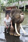
For the elephant reaching towards the camera (second from top on right), I shot in rapid burst mode while holding a bit of food for the elephant below the camera. As the elephant reached for the treat, I snapped away. I have an entire series of shots from that, but this one was definitely the best. Unfortunately with the overcast sky and bright conditions, the photo is over-exposed (which seemed to be a typical problem for many of the shots from the trip, and I wasn't paying enough attention to fix it - shame on me!).
Lastly, the elephant statue (bottom on right) shot was taken by Anya, and despite it being over-exposed (again, my fault for not adjusting the camera's settings for the conditions), I absolutely love the perspective produced by this shot. Everything in the shot is placed perfectly in the frame, and the exaggeration of the elephant's trunk helps to contribute to it being a nice line to lead your eye through the shot.
Drop me a comment and let me know what you think, and be sure to tune in again soon as I'll be starting into the underwater photos from Wakatobi!
- Bill
Poll: TTV Exposure
ktuli — Fri, 10/29/2010 - 13:36
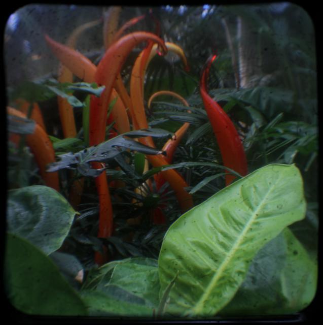
Ok - I mentioned this in a couple of the previous TTV posts, but I seem to prefer a darker or slight "under" exposed shot with this TTV photography. I can't quite put my finger on it, and so I thought I would put it out there to you guys for your opinion.
|
|
|
|
|
|
Technical Data: Canon EOS 7D TTV Argus Seventy-Five, Tokina AT-X M35 Pro DX AF 35mm f/2.8 Macro 1:1, 1/6 and 1/12 sec at f/8. ISO 200. Monopod and handheld. Cropped in Photoshop Elements 8.0. Phipps Conservatory.
Usually I don't share my choice early on, but like I've said - I definitely like the darker exposure. Vote below and then leave me a comment and let me know why you liked the one you did.
And of course, tune in tomorrow for more TTV goodness.
- Bill
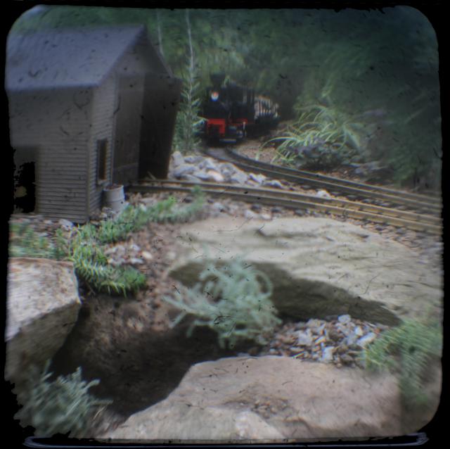
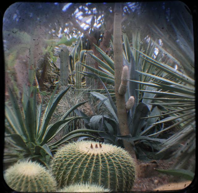
Some More TTV
ktuli — Tue, 10/26/2010 - 21:15
I apologize for not getting a post in yesterday - between uploading the photos and then starting to crop them and then heading to my photography class, I just didn't have time to post. However, I finished the rest of the cropping tonight, and will give you a couple more samples of TTV goodness, and then tomorrow I'll try and get some real posts written.
Technical Data: Canon EOS 7D TTV Argus Seventy-Five, Tokina AT-X M35 Pro DX AF 35mm f/2.8 Macro 1:1, 1/25 sec at f/6.4. ISO 200. Monopod and handheld. Cropped in Photoshop Elements 8.0. Phipps Conservatory.
Technical Data: Canon EOS 7D TTV Argus Seventy-Five, Tokina AT-X M35 Pro DX AF 35mm f/2.8 Macro 1:1, 1/40 sec at f/5.7. ISO 200. Monopod and handheld. Cropped in Photoshop Elements 8.0. Phipps Conservatory.
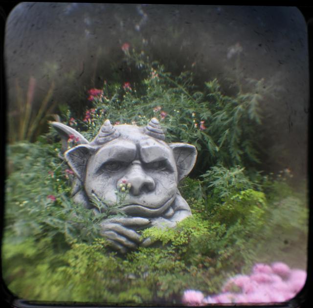
Technical Data: Canon EOS 7D TTV Argus Seventy-Five, Tokina AT-X M35 Pro DX AF 35mm f/2.8 Macro 1:1, 1/21 sec at f/9.1. ISO 200. Monopod and handheld. Cropped in Photoshop Elements 8.0. Phipps Conservatory.
The last one was shot by Anya, and after I let her have the rig, I didn't get it back the rest of the day... it is just that much fun to do this kind of photography.
Tomorrow, we'll take a look at how to build the contraption and discuss more details about what exactly all this is.
Stay tuned!
- Bill
Freezing Water Drops
ktuli — Tue, 09/21/2010 - 20:33
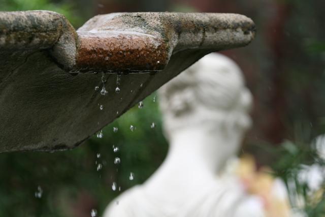
Ok, so I had a discussion recently about just how fast of a shutter speed you need to set to freeze moving water. So I decided to dig out these photos. Anya took these at Phipps Conservatory.
Technical Data: Canon EOS Digital Rebel XT, Tamron 180mm f/3.5 Di SP LD 1:1 Macro, 1/400 sec at f/5. ISO 400. No post production. Phipps Conservatory.
What Works: The droplets of water are nicely frozen, and excellently placed on one of the thirds. The light reflecting in the drops provides nice highlights that draw the viewers eyes quickly to them as the main focal element of the photo. And finally, the nicely softened background from the fairly wide aperture offers a hint at the stature behind the fountain without it being a distraction.
What Doesn't Work: The floating fountain is somewhat disturbing, providing just a small portion of the fountain base along the left edge of the frame would anchor the photo more. Also, the convergence of the fountain and the statue's head could have probably been fixed at the same time by repositioning slightly. There also is a very slight amount of camera shake from the shot being done handheld (because Phipps has a policy against tripod use)
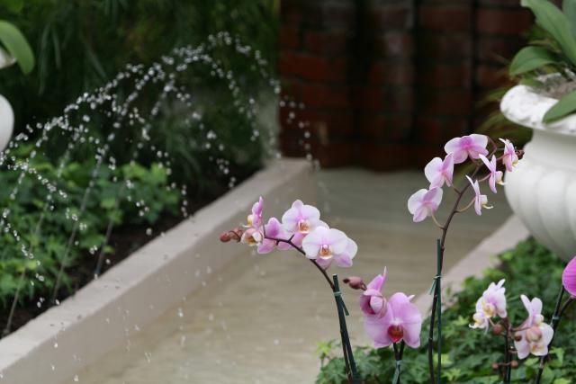
And just because I feel like it, we'll look at two photos today, so here's the second...
Technical Data: Canon EOS Digital Rebel XT, Tamron 180mm f/3.5 Di SP LD 1:1 Macro, 1/500 sec at f/5.6. ISO 400. No post production. Phipps Conservatory.
What Works: This shot does an opposite view from the one above, here the water drops become the background element, and let the orchids take the foreground focal element. The diagonal lines of the fountain base provide a nice offset in the image (diagonal lines are usually pleasing for whatever reason).
What Doesn't Work: The main thing that I don't like about this photo is the small bit of the flower pot encroaching on the left edge of the frame. With it being bright white, it is not able to be ignored.
Anyway - back to what started today's discussion, the shutter speed necessary to freeze water drops. Granted these water drops aren't exactly moving at the speed of bullets, but the exposures settings used are not pushing the boundaries of what the camera could do by any stretch of the imagination.
Should Anya have needed to freeze the motion more, she could have used a wider aperture, which would have allowed for an even faster shutter speed. Additionally, at ISO 400, she could have possibly increased that slightly to also allow for even faster faster shutter speed. And on top of all that, she could have also used flash to help provide additional light to freeze the motion.
The bottom line is that freezing motion like this is much easier than you might think. Give it a shot sometime and see what you can get.
- Bill
Frabel Cube
ktuli — Wed, 07/14/2010 - 19:32
Back in 2007, Anya and I made our first trip to Atlanta. We visited the Atlanta Botanical Garden and came away with plenty of good shots. Previously, I shared some photos of an installation called La Cabeza by Nikki de Saint Phalle.
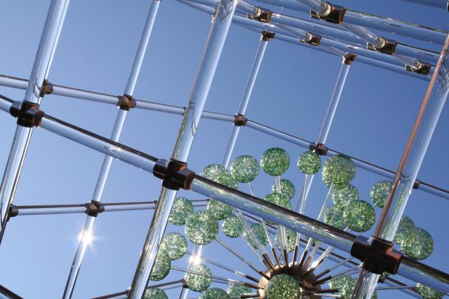
This one is called Large Cube with Imploded Spheres by Hans Godo Frabel.
Technical Data: Canon EOS Digital Rebel XT, Canon EF-S 18-55mm f/3.5-5.6 II at 34mm, 1/400 sec at f/16, ISO 400. No post production. Atlanta Botanical Gardens, Atlanta, GA.
Why This Photo: This installation was installed above a fountain in the center courtyard of the gardens, and the sunlight catching off the glass just sparkled and shimmered in the whole courtyard throwing mini-rainbows everywhere.
What Works: The diagonal lines produce an intriguing framing with the green spheres providing a nice balance to the photo by occupying approximately a third of the shot. Though obviously blown-out, the sunburst glare of the sun refracting through the glass is a very nice touch to capture some of that feeling of being there in the courtyard with the bright sun shimmering through the piece.
What Doesn't Work: The whole shot could possibly use a little darkening to make for a richer blue color in the sky, and a bit more pop to the green color of the imploded glass spheres. Focus is a touch off, and more detail showing the intricate patterns within the spheres would have been nice too.
I think we may have seen this installation somewhere else another time, but I can't remember where.
This is another photo that has been submitted to the Photographic Section's digital projected image competition.
Leave me a comment and let me know what you think of this photo.
- Bill
Mirror, Mirror
ktuli — Wed, 01/27/2010 - 20:22
So today's photo needs a little bit of an introduction. 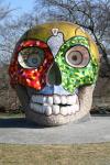
Three years ago, Anya and I took a trip to Atlanta for my birthday. We visited the Georgia Aquarium (I'm sure I'll be sharing photos from there eventually) and the Atlanta Botanical Gardens.
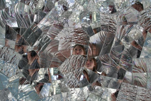
Outside the Botanical Gardens was this huge sculpture that looked like a Dia de los Muertos skull. We instantly loved it, and it only got better when we got closer and realized that we could also go inside of it!
And then super awesome just got better...
Technical Data: Canon EOS Digital Rebel XT, Canon EF-S 18-55mm f/3.5-5.6 II at 31mm, 1/100 sec at f/8, ISO 400. No post production. Atlanta Botanical Gardens, Atlanta, GA.
Why This Photo: The numerous mirrors inside this sculpture just made for such an interesting environment. I really am not one to take photos of people, I rarely do so, but when a situation like this happens and I can get what I feel is a creative, unique photograph of someone, I seem to grasp the opportunity.
What Works: Capturing Anya's expression in such a unique way really makes this photo for me. The fact that she is gazing up at this incredible sculpture and not paying any attention to the camera is vital. Though photographs of people usually work best if the subject makes eye contact, I think the fact that she is looking at the rest of the mirrors actually draws the viewers eyes off to look through the multiple additional captured images in each mirror segment, and yet always end up back at the original focal point.
What Doesn't Work: Quite simply, I wish I had framed myself out of the shot. I feel the image would be much stronger if I could have managed to make Anya to be the only discernible person reflected in the mirrors.
We went back a couple years after this, and unfortunately the sculpture was gone. So I didn't get the chance to go back and fix my previous composition. Someday, I hope to find this sculpture again - I think that would be incredible.
Let me know what you think! Post a comment and leave your own critique of this photo.
- Bill
PS: As a parting gift, here's the view through the mouth of this sculpture...
