practice
Dia de los Muertos Vignette (part 2)
ktuli — Sat, 03/02/2013 - 09:03
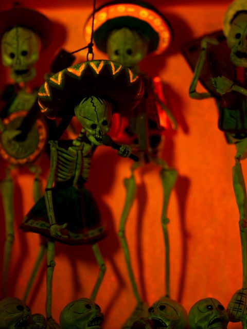
As promised, here is the shot of that vignette with the fluorescence gear. It is fun finding things around the house the fluoresce, and I felt this subject really looked good with it.
Technical Data: Canon EOS 7D, Canon EF 100mm f/2.8L Macro IS USM with Yellow 12 Filter and unknown extension tubes, 1/30 sec at f/2.8. ISO 100. Canon Speedlight 580EX II flash in eTTL mode and special fluorescence excitation filter. RAW processing in Adobe Camera Raw.
- Bill
Dia de los Muertos Vignette (part 1)
ktuli — Wed, 02/27/2013 - 20:42
Alright, I finally managed to motivate myself to get off my lazy butt and take some photos...
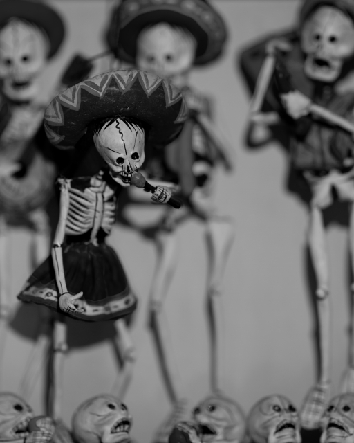
I spent probably 45 minutes working with this subject yesterday - trying different lenses, different lighting, and even the fluorescence stuff (more on that later). I knew I wanted to try converting these shots to B&W ahead of time, so I intentionally went for a shallow depth of field so that I could focus more on the tones of the scene. I'm not sure if I succeeded in getting a shot that converted well to B&W (or at least as well as I had wanted), but I did try a technique for further decreasing the depth of field of an image when your lens just can't achieve that effect.
The theory here is fairly similar to the focus stacking technique we've looked at previously. Basically, you take multiple exposures with different focus settings and then blend them together to achieve the look you're looking for. In this case, I simply used two images - one with the face of the main skeleton in focus, and a second with everything blurred. Obviously, because I wanted a shallow depth of field, I was using my lens' widest aperture for both shots - f/2.8 in this case.
I think processed both shots in ACR identically (actually, if you open both images in ACR, you can make your changes to one and then have it synchronize the changes to all other images opened at the same time). I then opened the sharp photo in Photoshop, converted the background to a normal layer, then created a blank layer. I then opened the blurred shot separately, converted its background layer to a normal layer, selected everything and copy/pasted it into the blank layer in the sharp image. This results in the blurred layer covering the sharp layer. Simply select the eraser tool, set your size and in this case I selected a medium hardness (so the edges of the eraser tool as I painted it would be a soft line instead of a hard sharp line - this helps to blend your edges)... then simply erase away the blurred layer to reveal the sharp layer underneath... I just did this to the main skeleton's face, hat, and microphone.
Here are the results with the two images used to make this composite - mouseover each to see how they work together to produce the final image (when you point the mouse away from the thumbnails, it will revert back to the composite)...
 Sharp Image |
 |
 Blurred Image |
|
 Original Edit |
Technical Data: Canon EOS 7D, Canon EF 100mm f/2.8L Macro IS USM, 1/40 sec at f/2.8. Image Stabilization on. ISO 100. RAW processing in Adobe Camera Raw, B&W and stacking processing in PS:CS5.
What do you think? Does that help or hurt the image?
- Bill
EDIT: I've decided to try another edit where I unblurred the singer's head and torso... I was beginning to feel that the original edit made the head feel disembodied.
Gone to the Birds (part 2)
ktuli — Thu, 02/16/2012 - 19:22
Today, we'll take a look at White Balance. In short, white balance is how to make something white in your photo actually appear as white when you view it. This isn't always how the camera records photos because - believe it or not - light actually has color to it.
Have you ever noticed how a photo taken in incandescent lighting sometimes looks yellow? Or how that shirt looks one color when you buy it in the store (fluorescent lighting) and looks completely different when you go outside (natural lighting)?
Not to bore you too much with the details, but that is the color temperature of the light. That color temperature is measured in degrees Kelvin - for example, sunlight is generally 6700K, fluorescent light is around 5000K, and moonlight (generally pretty blue) is around 4100K, etc.
In order to make white appear as white, you need to set your White Balance setting in your camera to match the color temperature of the light in which you are shooting. These days, cameras do a pretty decent job of figuring it out for you and setting your color temperature accordingly (this is your Auto white balance setting). An even better option is to shoot RAW, which allows you the option to adjust the color temperature after you take the photo, meaning with just one minor adjustment slider, you can ensure that the colors presented in your photos match what they were went you took the photo (if you want to adjust them further after that, that is up to you, but you at least start with accurate colors).
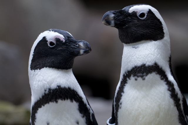
Ok - I guess I said I wasn't going to bore you, so let's get right on into the example that will show what I'm talking about. Below are a couple versions of the same exact photo. The only difference in them is the color temperature (and thus the white balance) - mouseover each thumbnail to see the larger image and get an idea of how color temperature in your lighting affects your photos.
 |
|||
 4400K |
 4950K |
 6700K |
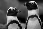 B&W |
Technical Data: Canon EOS 7D, Canon EF 100mm f/2.8L Macro IS USM, 1/640 sec at f/4. Image Stabilization on. ISO 400. RAW processing and cropped in Adobe Camera Raw. National Aviary, Pittsburgh, PA.
The original shot was recorded at 4950K - which is pretty accurate color temperature for outdoor lighting on a cold, overcast, winter's day. I normally bump photos to around the 6700K temperature range to most closely match sunlight, but as you can see in this case it just simply looks wrong, causing a yellow cast and making the photo far too warm for the subject. So I tried the slider in the opposite direction, trying a cooler light, eventually ending up on 4400K to give that slight bluish color to the photo, to cause it to look slightly colder - which I felt is perfectly fitting for the subject. And finally, I ran a quick black and white conversion just to eliminate the slight touches of color that were there and reduce the photo to its very basics.
What do you think? Does that help explain white balance and color temperature at all?
- Bill
Faux Smoke (part 2)
ktuli — Sun, 01/22/2012 - 15:40
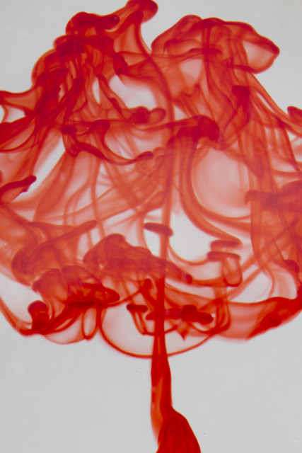
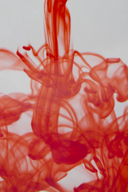
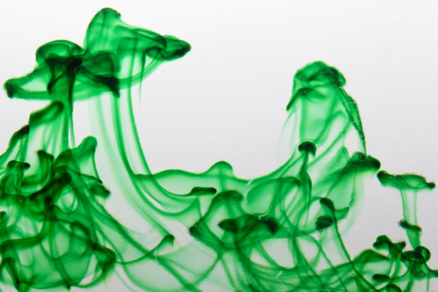
Here's a couple more of those faux smoke shots...
Technical Data: Canon EOS 7D, Canon EF 100mm f/2.8L Macro IS USM, 1/200 sec at f/22. Canon Speedlight 580EX II flash in auto mode and wireless control. Image Stabilization on. ISO 100. RAW processing and edits in Adobe Camera Raw (mouseover for original)
- Bill
Focal Length, Field of View, and Perspective
ktuli — Thu, 01/19/2012 - 20:41
If you've been following along (or checked the equipment list), you might have noticed that I now own four different macro lenses. You might also wonder why one would need that many different specialty lenses.
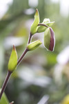
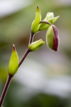
The answer is that each one provides a different focal length (35mm, 65mm, 100mm, and 180mm). While each one provides a different working distance to the subject, that causes different perspective, and also a different field of view. The field of view is basically the amount of the scene that is in the frame. Perspective can be thought of as the relationship of foreground elements to background elements.
 |
35mm | 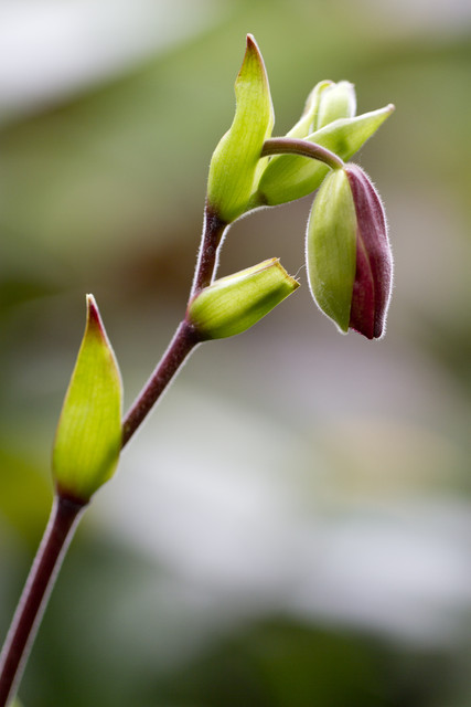 |
 |
100mm |
Technical Data: Canon EOS 7D, Tokina AT-X M35 Pro DX AF 35mm f/2.8 Macro 1:1 and Canon EF 100mm f/2.8L Macro IS USM respectively, 1/30 and 1/80 sec respectively at f/2.8. ISO 100. RAW processing in Adobe Camera Raw
In this case, I kept my foreground subject almost identical in the frame, but if you look at the background, you can definitely tell a huge difference. Here, I used a wide aperture to get a shallow depth of field, so the background is pretty well blurred and full of soft bokeh.
However, if you look at the shapes of the background, you can definitely identify a couple major differences. First, the 100mm shot has a much less cluttered background because it has a much smaller field of view. Additionally, the perspective causes the background elements to appear much larger in the frame (and thus making them seem closer).
- Bill
Faux Smoke (part 1)
ktuli — Wed, 01/18/2012 - 17:35
Ok - I think we'll stick with the abstract stuff today.
A while back, I saw this video from Adorama:
I decided to keep things a bit simpler than Mark did. My setup (which I forgot to take a photo of) consisted of just a clear drinking glass inside our light tent with a single strobe. I used my 100mm macro lens to allow me to move in close enough to eliminate the edges of the glass.
What do you think of the results?
Technical Data: Canon EOS 7D, Canon EF 100mm f/2.8L Macro IS USM, 1/200 sec at f/22. Canon Speedlight 580EX II flash in auto mode and wireless control. Image Stabilization on. ISO 100. RAW processing and edits in Adobe Camera Raw (mouseover for original)
This one reminds me of an abstract painting of some bonsai. Regardless of what you see, I think the technique is pretty fun, and I'm sure I'll try it some more in the future.
- Bill.
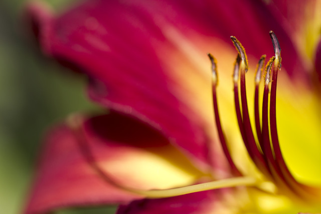
Depth of Field: Day Lily
ktuli — Wed, 07/20/2011 - 18:07
Alright, as promised, here are some more flower photos.
As I was shooting these day lilies, I tried several different apertures for different looks. Then I decided I would shoot a whole series and possibly print them for a framed set. Unfortunately, I don't think they work well to be framed, but it will work nicely to explain aperture and depth of field.
First - every camera lens has an aperture. It is the opening that allows the light to pass through the lens into the camera. Opening the aperture allows more light in, closing it allows in less light. Aperture values are represented in f/# notation. That notation is actually an equation - focal length of the lens / aperture value. So, if you have an 80mm lens, and select an aperture of f/8, that means that the opening to let the light in is 10mm. Bump up to f/16, and the opening drops down to 5mm.
So how does that apply to depth of field? Well, to start, let's define depth of field... in simplest terms, it is the amount of the scene that is in clarity (not necessarily focus, but we'll leave that for another time). The amount of depth of field is directly related to the aperture. Select a lower aperture value, and you get less depth of field; select a higher aperture value, and you get more depth of field. If you think of it in those terms, it is extremely simple. f/2.8 is going to have much less depth of field than f/16.
Where some folks get confused is when they look at the aperture sizes in relation to the f/# notation. f/2.8 is a very large aperture opening, f/16 is a small opening. Remember - that is because it is an equation, so a larger denominator produces a smaller result (remember your algebra?). However, if you think about it in terms of depth of field, it is somewhat easier to keep straight. Small f/# gives a small amount of depth of field; large f/# gives a larger depth of field.
Here is a good way to understand how a larger aperture opening (small f/#) gives more depth of field than a smaller aperture opening (large f/#) - say you have a bunch of M&Ms and you want to keep track of how many of each color come through an opening. If you have a large opening (large aperture/small f/#), it will be very hard to keep track of each individual candy that comes through, so you do some guestimating. Switch to a smaller opening (smaller aperture/larger f/#) and only a few candies will come through at a time, making your count much more detailed.
The trade off? It will take a lot longer to count the same number of M&Ms with a smaller opening. The same is true of photography and apertures and shutter speed... but we'll discuss that more later.
So take a look at these shots. Mouseover each aperture, and it will show the depth of field provided by that aperture. Slide along the apertures to see the progression. Compare the aperture size with the depth of field. When you get into the higher apertures, the difference is not as drastic, but look to the green plants in the background on the left for the difference.
Make sense? I think I'll probably keep an eye out for other good examples and do this kind of explanation again some time. At the very least, I'll have to show how shutter speed factors into things.
Drop me a comment and let me know what you think of this kind of post. Was it helpful? Was it confusing? Let me know.
Thanks for stopping by.
- Bill
Merry Christmas (part 2): Shaped Bokeh Tutorial
ktuli — Fri, 12/24/2010 - 13:01
I debated putting this off another day or two, but I guess like the Grinch, I had a change of heart and decided to stick with my promise from yesterday and tell everyone how to do this awesome little trick today.
Again, this one is fairly easy, but does require more preparation than the other two techniques I showcased yesterday (but not too much).
|
|
|
|
|
|
|
|||
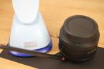
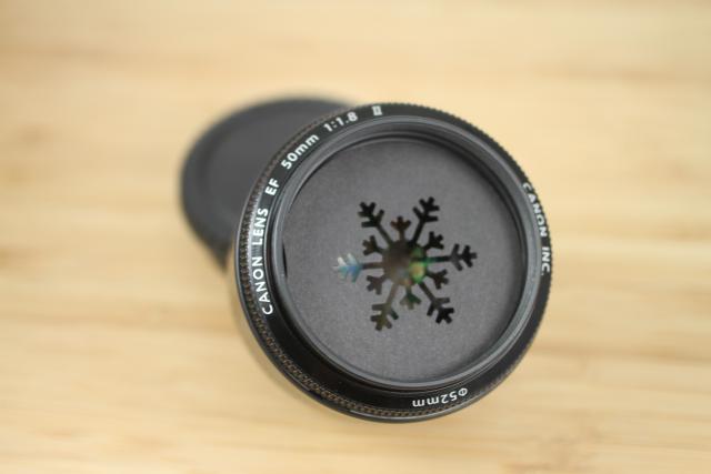
You will need the following items: black heavy cardstock, craft punches or a craft knife, a fast lens (f/1.8 would be really great - so hopefully you bought that cheap 50mm f/1.8 lens). And here are the instructions:
- Either trace the outside edge of the front of your lens or (as I did) measure the inside diameter of front of the lens (be sure to use the front of the lens, not the back where it attaches to your camera)
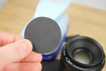
- If you have access to one, use a circle punch of the correct size or cut the circle out with scissors - this will be your blank
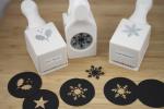
- Again, if you have access to various shaped craft punches, simply use them to punch out a shape in your blank. If you don't have one, or want to get more creative, draw a shape on your blank, then cut it out using a craft knife (like an X-Acto knife)
- If you traced the lens, you will attach the shape punched disc to the end of your lens using some tape. If you measured and cut based on the inside diameter, you can place the disc inside the end of the lens (mine seems to stay simply by pressure and getting stuck in the filter threads)
- Repeat the steps as many times as you want for as many shapes as you want to make!
- Then simply fire away - for my shots, I was just defocusing the lens manually and shooting
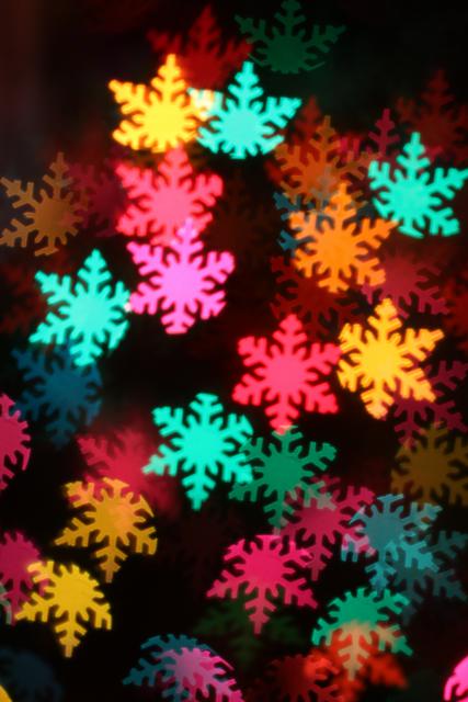
If the above steps seem a bit daunting, or if you just prefer buying things, there is a kit from Lens Baby that comes with pre-cut shapes as well as extra blanks. Luckily for me, Anya does a ton of crafting, so I have access to all those punches. Either way, you're well on your way to making fun photos like these:
|
|
|||
|
|
|
|
|
Technical Data: Canon EOS 7D, Canon EF 50mm f/1.8 II, 1/5th, 1/8th, 1/12th, 1/12th sec respectively at f/1.8, ISO 200. No Post Production.
Well, I hope you enjoyed the tutorial - my Christmas gift to you. Hopefully it inspired you to give this fun technique a try. Sorry that today's set seem a little blurry - I didn't have time to reshoot them.
Tune in again soon... next up is the Christmas TTV!
- Bill
Merry Christmas (part 1)
ktuli — Fri, 12/24/2010 - 00:25
Welcome all, and Merry Christmas! I've got posts for at least today and tomorrow (and maybe a couple bonus days after Christmas - we'll have to see). I hope everyone is enjoying a safe and happy holiday season (whatever you celebrate). 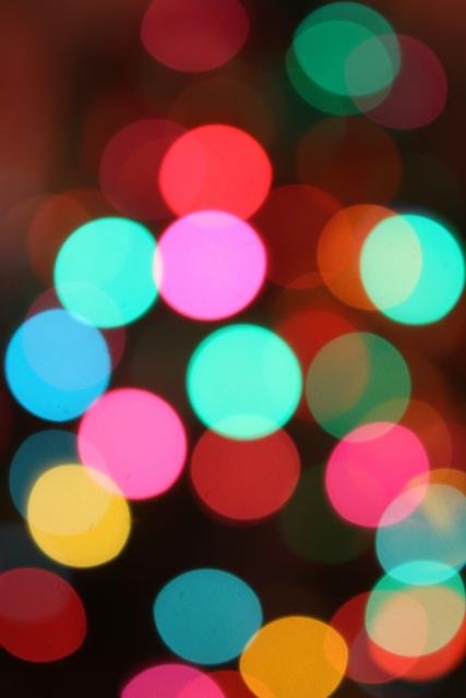
I decided to pull out a couple abstract photography techniques tonight, so take a look and see what you think. These manage some very interesting looks, and are surprisingly easier than you might think!
Intentional Defocus
I got the idea for this one from this Adorama Learning Center article on creative ways to shoot your tree. They say you need a tripod, but I shot mine hand-held with no problem...
Technical Data: Canon EOS 7D, Tokina AT-X M35 Pro DX AF 35mm f/2.8 Macro 1:1, 1/8th sec at f/2.8. ISO 200. No post production.
This is the easiest technique of all. Turn on your Christmas tree's lights, turn off the room lights. Set your widest aperture, flip to manual focus mode, then completely defocus your shot to make the tree lights turn into large globes of colored light. Then fire away. Easy as sliding down a chimney (or so I've heard!).
If you want, you could adjust the focus a bit to meet somewhere in the middle, and give more of the outline of the tree - this would work great if you've got a nice dark background (perhaps an outdoor decorated tree). Experiment!
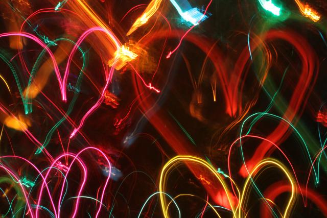
Camera Drawing
I don't know if that's what this technique is called or not - I'm sure I didn't just invent it, but I like that name, so we'll go with it. Actually - I just flipped through one of my creative photography books - it has a similar technique that involves tossing your camera, and of course there is the option to draw with your light while light painting.
But this technique gets a little more specific and detailed...
Technical Data: Canon EOS 7D, Tokina AT-X M35 Pro DX AF 35mm f/2.8 Macro 1:1, 5.2 sec at f/22.6. ISO 200. No post production.
This time, we're using the smallest aperture possible, which means you'll need a longer exposure (note this one was about 5 seconds long). I'd recommend shooting in manual mode, and playing around with the shutter speed to find what works well giving your amount of lights and complexity of your drawing.
Once you trip the shutter, intentionally "draw" your shape in the air with your camera. Unless you want to flip the shot in post production, you have to "draw" your shape upside down. It is a little tricky at first, but take your time and try it. It took me several shots to get these hearts drawn in a way I was happy with. Make slow, smooth motions and try to time the end of your "drawing" with the end of the exposure time or you'll end up with a bright spot.
Here's a couple other attempts:
So much fun! Ok - one more technique, but I'm just going to post a couple photos today - you'll have to stop back tomorrow (or maybe the day after - go enjoy the holiday with your friends and family) for the quick "how-to".
|
|
||
Use the now regular mouseover technique to get the small thumbnails to display in the larger image area.
This one was a ton of fun, and still pretty easy (though it does take a little more preparation). But I'll share that tomorrow.
Till then, go hang those stockings, set the cookies out, and spend some quality time with loved ones. And feel free to try out any of these techniques in between taking those memory saving photos.
- Bill
New Lens
ktuli — Wed, 03/03/2010 - 22:11
So after clicking refresh on the UPS tracking page for my new lens all day long and being presented with info that didn't make it look promising that it would be delivered today, it finally showed up around 5PM. I do have to say, this lens is very nice.
Big. Heavy. Kind of intimidating. But very nice.
So one of the cool features of this lens that none of my other lenses has is Optical Stabilization which is Sigma's term for Image Stabilization (if you're a Canon person... or Vibration Reduction if you're a a Nikon person... or Vibration Compensation if you're talking Tamron lenses... you get the picture - and with any of these features regardless of the name, it should be a little sharper (sorry, bad pun)).
So naturally I wanted to see if the OS was worth all the hype.

At 500mm without OS
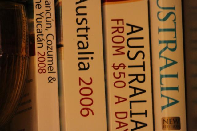
At 500mm with OS mode 1
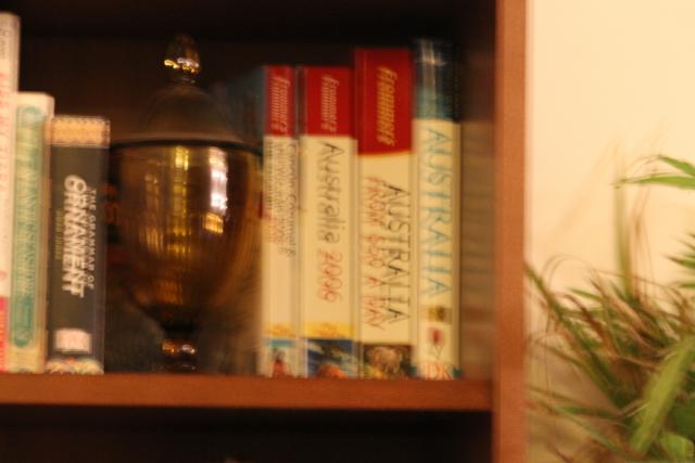
At 150mm without OS
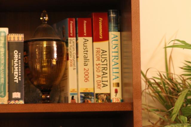
At 150mm with OS mode 1
All shots were taken at f/6.4 but the 150mm shots had a much longer shutter time for whatever reason (I wasn't looking to take quality shots, so I wasn't trying for perfection).
On a normal basis with a lens at 150mm, I have no problem holding the camera steady myself. With this lens, it simply is too heavy and bulky to be able to do that with the same level of ease.
I am, however, extremely impressed with the effect at 500mm.
The OS motor is semi-loud. Much louder than the auto-focus motor which is labeled as a HSM (hyper-sonic motor). The AF motor is near silent.
That's it for tonight, but I'm sure I'll post more about this lens in the coming weeks as I play with it more. I think the idea of a zoo trip this weekend has been kicked around already...
- Bill

