Reply to comment
Dia de los Muertos Vignette (part 1)
ktuli — Wed, 02/27/2013 - 20:42
Alright, I finally managed to motivate myself to get off my lazy butt and take some photos...
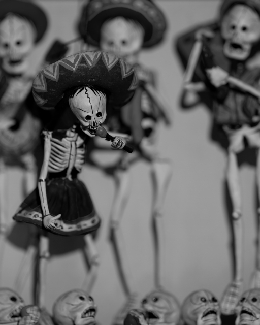
I spent probably 45 minutes working with this subject yesterday - trying different lenses, different lighting, and even the fluorescence stuff (more on that later). I knew I wanted to try converting these shots to B&W ahead of time, so I intentionally went for a shallow depth of field so that I could focus more on the tones of the scene. I'm not sure if I succeeded in getting a shot that converted well to B&W (or at least as well as I had wanted), but I did try a technique for further decreasing the depth of field of an image when your lens just can't achieve that effect.
The theory here is fairly similar to the focus stacking technique we've looked at previously. Basically, you take multiple exposures with different focus settings and then blend them together to achieve the look you're looking for. In this case, I simply used two images - one with the face of the main skeleton in focus, and a second with everything blurred. Obviously, because I wanted a shallow depth of field, I was using my lens' widest aperture for both shots - f/2.8 in this case.
I think processed both shots in ACR identically (actually, if you open both images in ACR, you can make your changes to one and then have it synchronize the changes to all other images opened at the same time). I then opened the sharp photo in Photoshop, converted the background to a normal layer, then created a blank layer. I then opened the blurred shot separately, converted its background layer to a normal layer, selected everything and copy/pasted it into the blank layer in the sharp image. This results in the blurred layer covering the sharp layer. Simply select the eraser tool, set your size and in this case I selected a medium hardness (so the edges of the eraser tool as I painted it would be a soft line instead of a hard sharp line - this helps to blend your edges)... then simply erase away the blurred layer to reveal the sharp layer underneath... I just did this to the main skeleton's face, hat, and microphone.
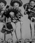
Here are the results with the two images used to make this composite - mouseover each to see how they work together to produce the final image (when you point the mouse away from the thumbnails, it will revert back to the composite)...
 Sharp Image |
 |
 Blurred Image |
|
 Original Edit |
Technical Data: Canon EOS 7D, Canon EF 100mm f/2.8L Macro IS USM, 1/40 sec at f/2.8. Image Stabilization on. ISO 100. RAW processing in Adobe Camera Raw, B&W and stacking processing in PS:CS5.
What do you think? Does that help or hurt the image?
- Bill
EDIT: I've decided to try another edit where I unblurred the singer's head and torso... I was beginning to feel that the original edit made the head feel disembodied.


