architecture
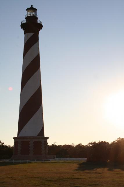
Hatteras Lighthouse
ktuli — Sun, 01/13/2013 - 17:34
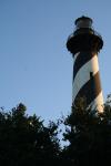
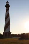
Ok - as promised, we're digging deep into the archive with today's post. These date back to the days of my (well, technically it was Anya's) first DSLR, and when I was still shooting in the automatic program modes... It seemed like things were more based in luck back then, but it did help to have an eye for nice shots. These days, I sometimes think I'm a bit overly critical and possibly even over think things.
 |
 |
 |
|
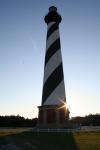 |
Technical Data: Canon EOS Digital Rebel XT, Canon EF-S 18-55mm f/3.5-5.6 II at 49mm, 42mm, and 22mm respectively, 1/130 sec at f/9, 1/400 sec at f/16, and 1/500 sec at f/16, ISO 100, 400, and 400. No post production.
I think it might be time for a trip back to Hatteras sometime soon.
- Bill
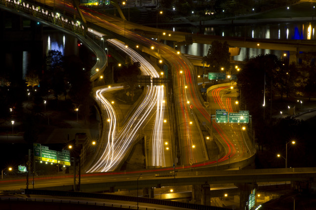
Pittsburgh at Night: Light Trails
ktuli — Tue, 11/22/2011 - 18:37
I think this is one of those cliche styles of photography that every photographer tries at some point, so it was just a matter of time before I gave it a spin. It is fun, and the results are interesting - even if they are a challenge to get something really worth keeping...
Technical Data: Canon EOS 7D, Tamron 70-300mm f/4-5.6 Di LD Macro1:2 at 176mm, 41 sec at f/36. ISO 100. RAW processing in Adobe Camera Raw.
Why This Photo: As I said, I think every photographer gives this a try at some point.
What Works: The symmetry of the light trails is really what caught my eye and I am glad that the end product does a good job of presenting it. Also, my new tripod worked well to keep the shot very steady even for a 41 second exposure.
What Doesn't Work: All in all, though, the photo is still pretty cliche, and quickly after browsing it, I think it can become stale. There are also some rather distracting elements scattered around the shot, but those are probably hard to avoid in such an urban setting.
I'm sure I'll try it again, so I'll just have to keep an eye out for a more interesting area to try next time.
- Bill
Poll: Roberto Clemente Bridge Exposures
ktuli — Mon, 11/14/2011 - 20:30
With the evenings getting darker earlier these days, I recently went out with a couple friends to get some night photography downtown. I came back with only a handful of keepers, but it was still a fun learning experience.
One keeper is actually two different exposures of the Roberto Clemente Bridge. One is a fairly short (1/2 second) exposure while the other is a much longer exposure at 25 seconds.
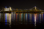 Short Exposure 1/2 sec at f/1.8 |
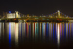 Long Exposure 25 sec at f/11 |
 |
|
Technical Data: Canon EOS 7D, Canon EF 50mm f/1.8 II, 1/5 sec at f/1.8 and 25 sec at f/11, ISO 100. Raw conversion in Photoshop CS5.
Mouseover each thumbnail for a larger view, then place your vote and leave a comment to let me know why you chose what you did.
- Bill
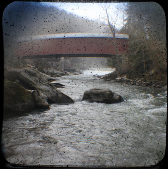
TTV: McConnell's Mill Covered Bridge
ktuli — Tue, 04/05/2011 - 20:05
Technical Data: Canon EOS 7D TTV Argus Seventy-Five, Tokina AT-X M35 Pro DX AF 35mm f/2.8 Macro 1:1, 1/16 sec at f/9.1. ISO 200. Monopod and handheld. Cropped in Photoshop CS5 Extended.
I'm busy with some other stuff tonight, so you'll have to provide your own critique. Thanks for stopping by.
- Bill
Bali: Barong, Temple, and Elephants
ktuli — Thu, 02/10/2011 - 20:36
It looks like we're sticking with that vertical format for today's photos... I tend to try using that format often, but for whatever reason, I used it to great extent during the trip.
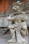
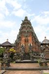
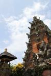
Today's set comes from our second and third days in Bali. First, we have a Barong costume. This was from a Barong Dance that we attended. Barong is the king of the spirits and protects Bali from evil. After the dance, we went to visit another temple - Pura Desa Batuan. Pura Desa Batuan is actually two separate temples, and the grounds have a great deal of statuary. We also visited several areas to see different Balinese crafts, but I'll save that for another day.
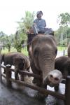
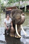
The third day, we visited the Elephant Safari Park where we got to ride an elephant through the jungle.
|
|
||
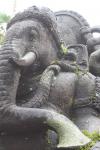
I like the feel of the photo of the statue (second from top on left), with the just slightly blurred background showing more of the intricate stone carving without being distracting, plus the placement of the statue covering two thirds of the frame provides a nice balance to the photo.
Whereas the first photo of the temple (third from the top on left) is very symmetrical and is generally just a record shot, the second photo (bottom on left) provides a much more dynamic vantage point, and adds a feeling of drama to the scene. I do regret not including a tiny bit more temple and a little less sky in the shot, but I do certainly like how the darker exposure makes for a much more moody feel to the second photo as well.
For the elephant reaching towards the camera (second from top on right), I shot in rapid burst mode while holding a bit of food for the elephant below the camera. As the elephant reached for the treat, I snapped away. I have an entire series of shots from that, but this one was definitely the best. Unfortunately with the overcast sky and bright conditions, the photo is over-exposed (which seemed to be a typical problem for many of the shots from the trip, and I wasn't paying enough attention to fix it - shame on me!).
Lastly, the elephant statue (bottom on right) shot was taken by Anya, and despite it being over-exposed (again, my fault for not adjusting the camera's settings for the conditions), I absolutely love the perspective produced by this shot. Everything in the shot is placed perfectly in the frame, and the exaggeration of the elephant's trunk helps to contribute to it being a nice line to lead your eye through the shot.
Drop me a comment and let me know what you think, and be sure to tune in again soon as I'll be starting into the underwater photos from Wakatobi!
- Bill
Bali: Uluwatu Temple & Kecak Fire Dance
ktuli — Wed, 02/09/2011 - 21:03
I'll be deviating from the normal method of doing things for the photos from this trip. There are far too many photos and too much background information for each photo to try posting them individually. The posts will likely be longer than normal, but will likely contain more photos and less technical discussion (though there will still be some - this is a photography site after all!)
Our trip began in Bali, Indonesia after a total of 28 hours of travel time and a 13 hour timezone adjustment. We got into Denpasar in the wee early morning hours on Jan 22nd, made our way to our hotel - the Puri Santrian resort (perhaps more on that in another post) - and crashed for a few hours. We spent the morning and afternoon lounging around the hotel, some folks hopped into the beautiful pool, while Anya and I strolled the grounds taking photos (of course!).
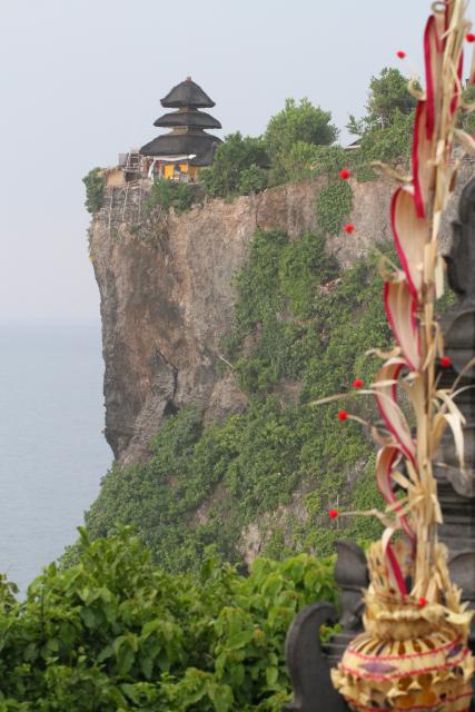
Towards late-afternoon, we headed off to the beautiful Uluwatu Temple (Pura Luhur Uluwatu). Uluwatu is a directional temple in Bali's south-west region which is meant to guard Bali from evil spirits. The temple sits up at the very edge of a 250 foot cliff that overlooks the Indian Ocean.
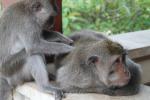
One of the major residents of the temple are monkeys. And apparently, these are thieving monkeys. The general setup is this: Tourists come, monkeys steal stuff from tourists, tourists buy fruit from vendors, tourists bribe monkeys with fruit to get their stuff back. Luckily we didn't have anything stolen, though Brigette apparently almost lost a fistful of hair when a monkey attempted to steal her hair band.
After visiting the temple and taking in the view from the cliffs, we proceeded to the Kecak Dance (or Ramayana Monkey Chant, or Fire Dance) nearby. The Kecak Dance is kind of interesting as it was basically invented by a couple westerners as a way to present some Balinese culture in a way that would appeal to westerners' limited tastes.
As usual, mouse over the thumbnails for the larger image to display.
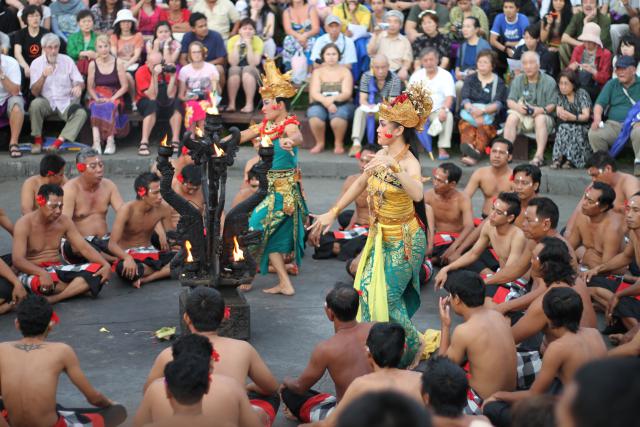
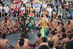
The dance consists of a circle of men who chant all of the "music" for the dance (visible in the shot second from the left above). They repeat a few sounds over and over, sometimes alternating sounds between different sections of the group. There are no musical instruments or spoken words to the story depicted in the dance, so the chanting provides the rhythm and marks the important events in the story.
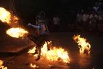
At the end of the dance, they set up a bunch of piles of what I thought was shredded coconut husks and set them on fire, and the monkey character then gets to kick them around (as depicted in the shot to the far right). It wasn't quite what I expected when I was told we were going to a "fire dance" - I think I was thinking of something more Hawaiian with a guy twirling a flaming baton, but this was still entertaining and impressive.
For the dance (and whole trip), I was limited in the lenses I was able to use. I switched between the Canon EF 50mm f/1.8 II and my new Canon EF 100mm f/2.8L Macro IS USM. I wanted the wide apertures (f/1.8 and f/2.8) to help with faster shutter-speeds given the twilight and then dark conditions. Also during the dance, I switched to automatic ISO mode, to allow the camera to select higher ISOs to also allow for faster shutter-speeds. I found that I took a good deal of photos in a vertical orientation (see below) as a way to both capture more of the character's full costume as well as a way to eliminate clutter and unnecessary elements (ie: spectators). If you're interested in any of the specific technical data for any shots here, simply post a comment and I'll provide them.
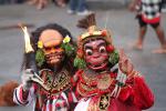
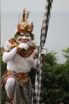
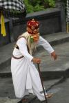
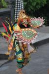
I am not going to go into the roles of each character, but provide some photos of each. Above there is a photo with two characters who basically provided comic relief, and I swear the one looks like Predator! Others include the Monkey, a bird of some sort, and others (see below). The costumes were really interesting, and you can see my usage of the vertical format to be able to isolate a single character.
 |
|
|
 |
||
 |
||
 |
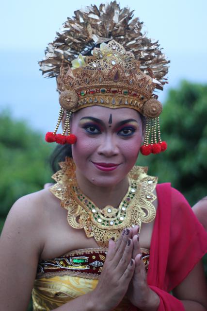
The last photo there - of the one female dancer - is Anya's favorite of this set. The wide aperture (f/1.8) on the 50mm lens used provides the nice soft background. Additionally, the vertical format allowed me to isolate the woman in the shot while she was flanked by tourists, all pushing to get their own photos alongside the performer.
Given the dim lighting and general disarray and constantly moving subjects, all of these shots came out fantastic. So remember the lessons here. Shorten your exposure time (faster shutter speed) as much as possible by (1) using as wide of an aperture as possible, (2) if your camera works well at high ISOs, switch to auto-ISO mode. Additionally, remember that sometimes the vertical format will help you to eliminate distracting elements from your photos, so rotate the camera and see what you can get.
- Bill
Frabel Cube
ktuli — Wed, 07/14/2010 - 19:32
Back in 2007, Anya and I made our first trip to Atlanta. We visited the Atlanta Botanical Garden and came away with plenty of good shots. Previously, I shared some photos of an installation called La Cabeza by Nikki de Saint Phalle.
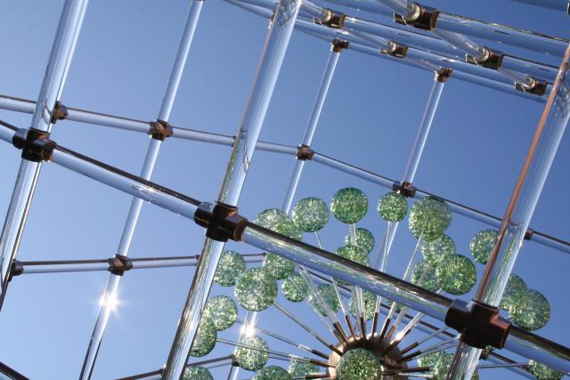
This one is called Large Cube with Imploded Spheres by Hans Godo Frabel.
Technical Data: Canon EOS Digital Rebel XT, Canon EF-S 18-55mm f/3.5-5.6 II at 34mm, 1/400 sec at f/16, ISO 400. No post production. Atlanta Botanical Gardens, Atlanta, GA.
Why This Photo: This installation was installed above a fountain in the center courtyard of the gardens, and the sunlight catching off the glass just sparkled and shimmered in the whole courtyard throwing mini-rainbows everywhere.
What Works: The diagonal lines produce an intriguing framing with the green spheres providing a nice balance to the photo by occupying approximately a third of the shot. Though obviously blown-out, the sunburst glare of the sun refracting through the glass is a very nice touch to capture some of that feeling of being there in the courtyard with the bright sun shimmering through the piece.
What Doesn't Work: The whole shot could possibly use a little darkening to make for a richer blue color in the sky, and a bit more pop to the green color of the imploded glass spheres. Focus is a touch off, and more detail showing the intricate patterns within the spheres would have been nice too.
I think we may have seen this installation somewhere else another time, but I can't remember where.
This is another photo that has been submitted to the Photographic Section's digital projected image competition.
Leave me a comment and let me know what you think of this photo.
- Bill
Light Painting: First Attempt
ktuli — Tue, 05/04/2010 - 20:12
Ok - so the posting frequency doesn't seem to be getting much better. I promise to continue trying to get better about that. Heck - I haven't even had much chance to get out and use the camera much either - something I definitely need to remedy.
This is another photo I was hoping to save for use later, but I really need something to get me going.
In one of my photography magazines, I had read about a technique called light painting. There are two forms of light painting - using a light source outside of the scene to 'paint' a section of the scene to highlight it, and using a light source within the scene to 'paint' the air to have a type of graffiti appear in the image.
I decided to try the former. By using different colored lights to highlight your subject, you can change its color dramatically...
Back in November, I went on a hiking trip on a section of the Laurel Highlands Hiking Trail with some good friends.
While we spent the night at one of the adirondacks, I tried my hand at some nighttime long exposure photography and light painting. After taking a fair amount of good-natured kidding from my buddies about the extra weight I was lugging in camera gear for the hike, the photos I got really made it worth while.
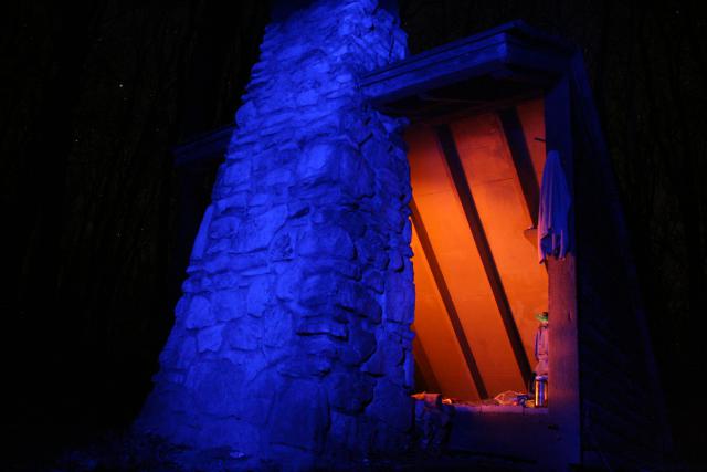
Technical Data: Canon EOS Digital Rebel XT, Canon EF-S 18-55mm f/3.5-5.6 II at 18mm, Unknown manual exposure length at f/5.6, ISO 1600. No post production. Laurel Highlands Hiking Trail.
Why This Photo: I really wanted to try my hand at light painting, after a few other attempts that were coming out very nicely, I thought the blue light on the outside of the shelter contrasted with the red glow from the fire inside the shelter would do a great job of illustrating the cold weather (though it was unseasonably warm for November) with the warmth of the shelter.
What Works: For being basically a first attempt, this turned out well. I like the contrast of the red and blue lighting. Additionally, you can just start to make out the stars in the background.
What Doesn't Work: The framing isn't perfect as I think this might work better if the shelter were more off-center. I also should have selected a much lower ISO for this long of an exposure to help reduce any digital noise.
Surprisingly, this was a lot easier than you would think. Remember your tripod, and a remote shutter release is helpful (or use your timer delay, but that won't work for manual exposure lengths). Try different combinations - I'll share a photo later where I used red and blue lights to paint something purple!
I thought for sure I would end up with a bunch of junk photos, but a couple of these are among my favorite photos. Unfortunately, I have never made a point of heading back out to make some more of these photos.
Maybe it is time to schedule another hiking trip.
- Bill
Shoot Favorite Local Locations
ktuli — Mon, 02/15/2010 - 21:05
I am trying to get better about this - once things warm back up again, I'll try to get back into the habit I started of carrying my camera with me full time. For now I feel the repeated heat/cold wouldn't be a good thing for the camera. Anyway...
Sometimes you don't need to travel to far off locations to get great shots. Remember - look for creative photos in what you see almost every day.
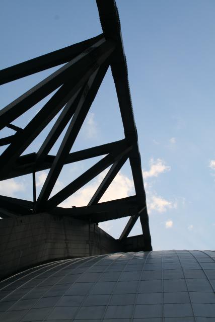
Technical Data: Canon EOS Digital Rebel XT, Canon EF-S 18-55mm f/3.5-5.6 II at 27mm, 1/250 sec at f/11, ISO 400. No post production. Mellon Arena, Pittsburgh, PA.
Why This Shot: I've always liked the architecture of the Mellon (I still like to call it the Civic) Arena. As Anya and I stood in line to get in to a game (actually on the same day we got engaged over 200 miles away in Niagara Falls), I looked up at the large steel support structure and decided I should click off a couple shots.
What Works: Strong composition of the photo seems to draw the viewers eye through the shot. The repeating patterns of the support structure and the roof tiles allow for a lot to look at in an otherwise simple composition. The bright blue sky finishes things off nicely.
What Doesn't Work: The shot is ever so slightly off level - though easily fixed with some minor rotating and cropping. The sky is just a bit over exposed, and the position of the clouds is somewhat distracting - had they been in the open area of sky, they may have been more pleasing.
This image might actually be better done as a bracketed set or HDR image to be able to gain the crisp detail in the arena and yet get the best pop out of the blue sky. Perhaps some day I'll head down there to try this one again. Though I guess I shouldn't procrastinate too too long - it will be sad to see the arena go away. It has so much character and I for one will miss the Igloo!
I hope to get to start collecting more architectural images in the future. It is an area I am interested in and so often overlook. I just need to remember what amazing photos I can get in my own backyard.
- Bill

