macro
Bees and Flowers (part 1)
ktuli — Thu, 10/07/2010 - 10:05
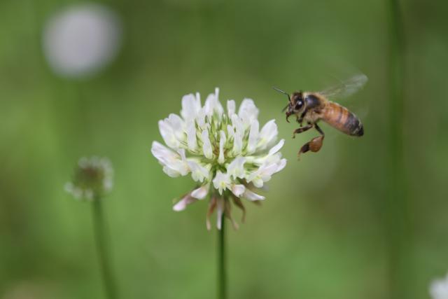
Well, summer has officially been over for a couple weeks now, and the weather is quickly following suit. Which means that sights like these are all but over for a while.
Fall is probably one of my favorite seasons - the cooler weather is more conducive to outdoor activities, hockey season starts back up, and the fall foliage is always a wonderful gift from nature. Since we had such a hot and dry summer, I don't know colorful of a fall we'll get this year, so I figured I'd let summer linger a little longer.
Technical Data: Canon EOS 7D, Tamron 180mm f/3.5 Di SP LD 1:1 Macro, 1/510 sec at f/3.5. ISO 200. Dolica AX620B100 tripod. No post production. Kanawha State Forest, Charleston, WV.
Why This Photo: I frequently try for photos of insects in flight, and after hiking around for about five hours this day, I decided to take a break by sitting in a field of wild flowers and waiting to see what would come to me.
What Works: The shallow depth of field (which is necessary to help get the fast shutter speed to freeze the motion of the honey bee and flowers in the breeze) produces a nicely blurred background. The focus is fairly sharp, though a bit blurred on the bee itself - whether from missed focus or from motion blur. The catch-light in the bee's eye is a nice touch.
What Doesn't Work: The composition is a bit bland with the flower at the dead center of the photo, perhaps a post production vertical crop would convert this to a more functional photo.
I have a handful more flower and bee photos, so I'll get around to sharing them sooner or later.
- Bill
Kanawha State Forest Spider: Redux
ktuli — Mon, 10/04/2010 - 16:01
If you have been following along, you know that I am not big on photoshopping my photos very much. Partially this is because I'm a purist and would rather get the "perfect" shot right with the camera, partially because I generally feel I do a bad job when trying to use Photoshop, and partially because I really hate poorly and obviously photoshopped images.
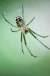
But the other day, I was able to take one of my all-time favorite photos I've ever taken and make it better with several small adjustments with Photoshop Elements.
The photo in question is one in a set of photos taken of a cool looking spider we had found in Kanawha State Forest near Charleston, WV. I debated saving this modified version to discuss sometime in the future when I needed a post to get me going, but between the good results I got and really liking the nice mouseover trick I found recently, I just couldn't wait.
 |
Original Image | 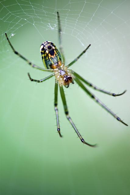 |
 |
Auto Adjusted | |
 |
Spot Heal tool on thorax to remove hotspot. Darken highlights 50% on abdomen. | |
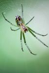 |
Clone Stamp tool used to touch up leg that touched right edge of frame. |
As you can see, the adjustments are very minor, and if you didn't know they happened, you probably couldn't even tell. Heck - some of them, you'll probably have to look very closely to see the difference between the two images when they're displayed even like they are here (I find myself sliding my mouse back and forth over the thumbnails to have the change flip back and forth on the larger image). But to me, that is a successfully photoshopped image - one where you can't even tell that photoshop was used.
I am submitting this photo to an upcoming Photographic Section digital projected image competition, so we'll see how my minor adjustments do. I with I could submit both photos and see which one scored better to see whether the edits were worthwhile.
Regardless, I managed to take one of my favorite photos and make it that much better. I'm glad I didn't have this one printed and framed yet, because it definitely would have to be redone with this new version!
- Bill
More Mossy Frog
ktuli — Wed, 09/08/2010 - 18:45
So today's shot is a different perspective.
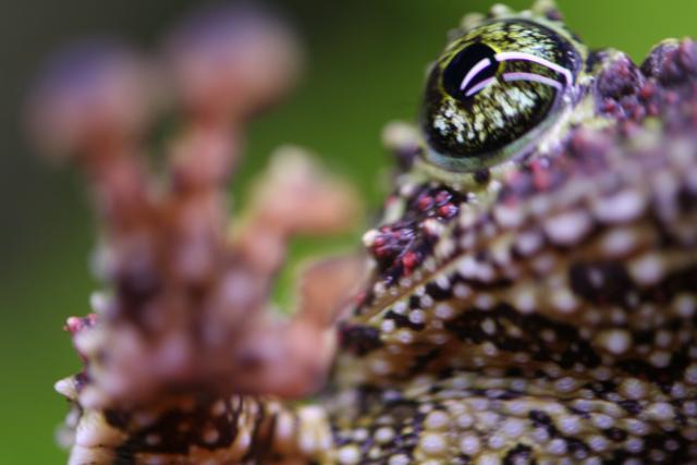
Technical Data: Canon EOS Digital Rebel XT, Tamron 180mm f/3.5 Di SP LD 1:1 Macro, 1/25 sec at f/3.5. ISO 400. No post production.
What Works: I really like the composition of this shot. It is a different view from most frog photos. Also, the background with the green gradient to black is very pleasing (much more so than the blue to purple that yesterday's shot has).
What Doesn't Work: The focus is a bit off, and the catch-light again is a bit annoying with how obvious it is about it being the fluorescent lights from the tank. And also like yesterday's photo, the depth of field could have been a bit deeper to get more of the frog in focus. Perhaps I should have focused on the foot and those cool sticky finger pads instead?
- Bill
Mossy Frog
ktuli — Tue, 09/07/2010 - 21:07
So I don't know if I've mentioned it here before or not, but for a couple years, I owned my own pet store. I previously had been an avid aquarium hobbyist, keeping multiple fish tanks and terrariums with different species of lizards, newts, and my particular favorite - frogs. While owning the store, I had access to a lot more species of frogs, and I managed to secure some Vietnamese Mossy Frogs (Theloderma corticale).
Unfortunately, I've recently lost one of these frogs. After growing the frogs out from very young froglets (yes, that's a term!), I figured out I only had males. Each night, they call and call to no avail. And every once in a while, they decide to try mating anyway, and quite often result in drowning one of the frogs. It really is extremely unfortunate, and I wish I could get my hands on some female frogs, but after discussing it repeatedly with probably the top breeder - Patrick Nabors - it seems captive breeding produces more males than females, and thus females are pretty hard to come by.
Anyway - they're quite good photo subjects:
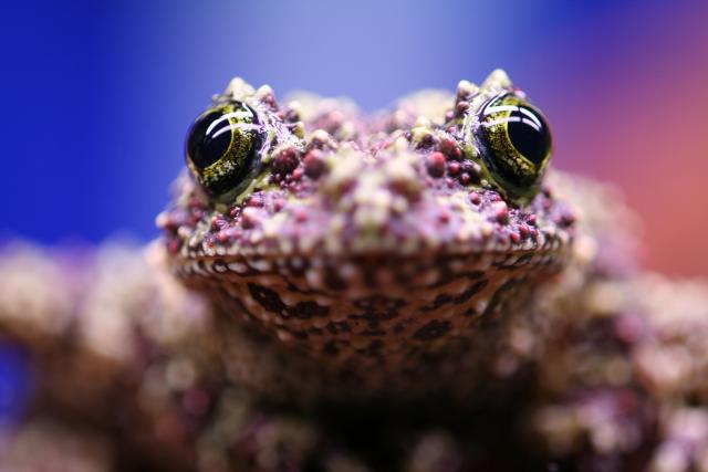
Technical Data: Canon EOS Digital Rebel XT, Tamron 180mm f/3.5 Di SP LD 1:1 Macro, 1/20 sec at f/3.5. ISO 400. No post production.
Why This Photo: I don't remember exactly why I took this photo, I was either messing around with the macro lens, or just taking photos for the sake of taking photos.
What Works: The focus is tack sharp right on the frog's eyes - revealing a good look at the beautiful irises. It also does a good job of capturing the texture of the skin on these masters of camouflage.
What Doesn't Work: The depth of field is a bit too shallow. The fact that the background is blurred is nice, but it probably would be better if the nose of the frog was in focus as well. The catch-light in the eyes of the frog are nice, but the fact that you can plainly see that they are two fluorescent lights is kind of distracting.
What do you think? These are cool frogs, and recently, I purchased another photo book to add to my collection. This one is called Frogs: And Other Amphibians (though I got mine much cheaper at Half Price Books) by Paul Starosta (apparently his whole site is in French, so good luck).
The new book has me thinking about getting more frogs, but for now, I figured I'd share some photos of the ones I have.
- Bill
PS: I made another kayaking video this weekend too. Enjoy...
New Lens: Tokina M35 Macro
ktuli — Wed, 08/04/2010 - 21:19
Normally, you wouldn't think of macro when you think of a 35mm lens, but that's exactly what got delivered to my door today.
This is a Tokina AT-X M35 Pro DX AF 35mm f/2.8 Macro 1:1.
I have been debating what lens to buy next, and to be honest, this lens wasn't really on the list until recently. There are many other (read: more expensive) lenses on the list, and because the budget is still pretty tight (need to save up for our Indonesia trip) I had to go with a less expensive lens. As I said, you don't normally think of macro photography with 35mm lenses, and that was part of what drew me to this lens. I had been looking at 60mm, 90mm, and 100mm macros from both Canon and Tamron.
But the deciding draw to this Tokina was its minimum focusing distance - a mere 5.5 inches. In messing with the lens just tonight after unpacking it, that means basically right up to the front of the lens. In fact, if I leave the lens hood on (which I will discuss shortly) literally is shorter than the lens!
So let's get down to some details about the lens... some pros and cons and interesting facts.
Price: This is certainly a budget lens, so we'll have to keep that in mind that this is not a Canon L-series lens. But at $309 at Adorama for their lens kit (which includes the lens, a UV filter, a lens cap leash, and a lens care kit) it is certainly affordable.
Size: The lens is small, and thus very portable. It weighs only 340 grams (almost 12 ounces), and is 60.4mm (about 2.4 inches) long at its shortest length (focused to infinity). So it will be an easy addition to my camera bag - which means it increases its chances of being used and not just left at home.
Construction: So far, the construction seems very sturdy - except for the AF/MF "switch" which I'll get into below.
Aperture: The lens has aperture ranges from f/2.8 to f/22 and uses 9 blades, which I haven't had a chance to test, but supposedly produces some really nice bokeh. I have the feeling that this lens will end up being a very nice portrait lens with its equivalent 52mm focal distance on my camera's APS-C sensor and the nice blurred backgrounds with the f/2.8 maximum aperture.
Focusing: Remember - we're talking about a budget lens here, so there's no hypersonic motor here, so AF is a little slow and a bit noisy. However, the lens doesn't take too long to seek and finds focus pretty well. There is a nice large focus distance scale display window which even provides info regarding the macro magnification ration info.
Additionally, the lens has a focus distance limiter switch - something I've never seen before. Basically the switch lets you select from the whole range (infinity to 5.5 inches) or break it into two sections with a break at about 0.55 feet (so infinity to 0.55 feet or 0.55 feet to 5.5 inches) - this feature will help reduce any lengthy seeking when by eliminating half the range if you don't need it.
However, the focusing system is where I have my only complaints so far. First, the AF/MF "switch" is actually the focusing ring. My Tamron 180mm Macro lens uses a similar setup, but I think because of the size of this lens, it misses the mark. Basically, you slide the whole focusing ring forward to select AF and back towards the camera to select MF. Unfortunately, where this feature is smooth and simple on my Tamron lens, it feels clunky and uneven on this Tokina lens. It sometimes sticks, and you can't flip between modes with a thumb, but rather have to carefully make sure to slide the ring evenly at all points along the circumference.
Additionally, messing with the lens tonight, I've found that if I slide through the focus range with the lens pointed up, it seems to catch and get hung up from time to time. I don't know whether it would damage it trying to use auto focus while pointing the lens up, but I think I'll avoid trying it. If the lens is pointed horizontally or downward (which is obviously the more common orientation) it is smooth and I have not noticed it catch once.
Accessories: This lens comes with only one accessory standard (I'm not discussing the bonus stuff I got with Adorama's kit) which is a small metal lens hood (MH-522). It threads into the lens like a filter, and if you don't know to look for it, you'll likely miss it. I honestly am not sure if this lens hood is necessary as the front element of the lens is pretty deeply recessed in the lens to begin with.
Other: Lastly, I don't know exactly what to say about this, but if you use Canon SLRs, you know that they use a white square to indicate the mount point for EF-S lenses and a red dot for EF lenses. This lens has a white dot on the barrel and a red dot on the flat part that sits flush to the camera. I'd say this is very odd, but interestingly enough, my Sigma 150-500mm lens has a red dot on the barrel and a white dot on the lens end. Weird.
All in all, I'm fairly pleased with this lens so far. I wandered around the house trying to decide what to take photos of to test with, and hopefully those matchstick photos work. But the truth of the matter is that the proof will be in the pudding, and we'll see what kind of photos I can get with this lens out in the field, so stay tuned to see what I can come up with.
- Bill
In the Meantime: Cactus
ktuli — Tue, 07/27/2010 - 21:07
While I sort out what it going on with my internet connection at home, I am unable to upload new photos, so you have to wait for more 2010 Vintage Grand Prix. Which means more of my typical photography.
Today we zip over to the Franklin Park Conservatory in Columbus, OH. And as usual, look at more macro photography.
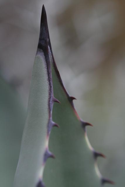
Technical Data: Canon EOS Digital Rebel XT, Tamron 180mm f/3.5 Di SP LD 1:1 Macro, 1/320 sec at f/4.5. ISO 400. No post production. Franklin Park Conservatory, Columbus, OH.
Why This Photo: There is just something about macro photography that draws me in. It causes you to look at something a little differently, and possibly see something you would normally not see, or pay attention to something you'd overlooked. And for whatever reason, that always applies with cacti for me.
What Works: The critical focus hits right on the mark with the center thorn of the cactus in tack sharp focus (yeah - I mean that pun!). The simplicity of the shot keeps my focus and draws me in without being too distracting. Finally, the macro angle allows you to see something differently - at times I look at this shot of a small cactus thorn and it honestly reminds me of a fossilized whale jaw that hangs on the wall at the Carnegie Museum of Natural History in much the same orientation as this.
What Doesn't Work: While the shallow depth of field produces a nicely blurred and non-distracting background, there is simply nothing at all discernible in the background and is at times a tiny bit confusing. Additionally, the depth of field is so shallow that the secondary thorns are blurred as well. And unfortunately, the colors are a bit muted - almost to the point of being a monochrome shot.
I also like the framing of the shot and the fact that I managed to avoid breaking the edge of the frame with the center point of the thorn (which is a very typical problem I have if you've been following along).
I also took another shot of these same cacti that encompassed a wider shot and more of the thorns, but I just can't decide whether I like it as much.
Drop me a comment and let me know what you think. Hopefully I'll have an internet connection working at home soon so that I can start uploading new photos, or you'll have to deal with a few more old photos... hope you won't mind.
- Bill
Resting Julia Butterfly
ktuli — Sat, 07/24/2010 - 21:53
Our last visit to Phipps was also to see what we could find at their Butterfly Forest.
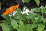
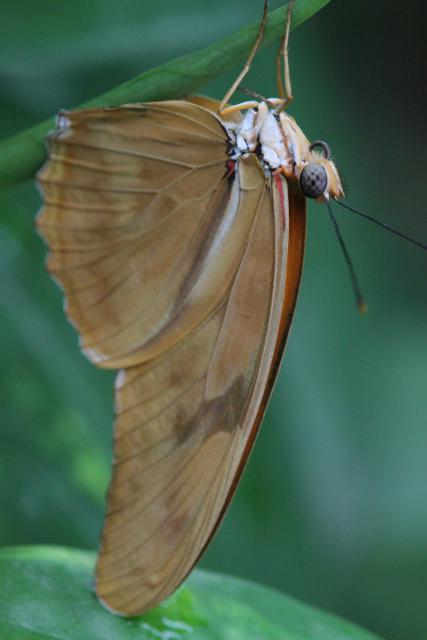
This Julia Butterfly (Dryas iulia) isn't necessarily the flashiest of butterflies. Even with its wings open, it is simply an orange butterfly as you can see to the right. However, when their wings are closed, they're even less spectacular.
But that doesn't make them any less interesting as a photographic subject in my opinion.
Technical Data: Canon EOS 7D, Tamron 180mm f/3.5 Di SP LD 1:1 Macro, 1/260 sec at f/6.4. ISO Auto. Canon Monopod. Phipps Conservatory, Pittsburgh, PA.
Why This Photo: Honestly, I was out specifically to take photos, and specifically out to take photos of butterflies, so...
What Works: Focus is sharp even with only using a monopod with the focus hitting right on the butterfly's eye and mouth.
What Doesn't Work: Framing is just a touch off with the one antenna and the feet of the butterfly break the edge of the shot, and the depth of field could be a bit deeper as the edges of the wings are not as sharp as they could be.
What I'm Not Sure About: I honestly can't decide whether I like the upside-down shot of the butterfly, and can't tell if this shot is interesting or just flat and boring.
Butterfly shots are tricky, but maybe that is why I keep trying them - I like the challenge, and I feel that once I can pull it all together and get that one perfect shot it will be all worth it. Is there a particular shot you keep trying for?
- Bill
Grasshopper at Phipps
ktuli — Wed, 07/21/2010 - 16:01
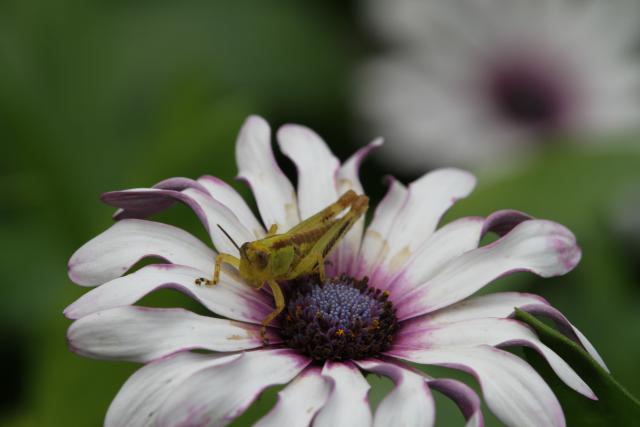
I don't know if Phipps really likes pests like grasshoppers jumping around their greenhouses, but during out last visit we saw a couple around,
Technical Data: Canon EOS 7D, Tamron 180mm f/3.5 Di SP LD 1:1 Macro, 1/330 sec at f/9.9. ISO Auto. Canon Monopod. Phipps Conservatory, Pittsburgh, PA.
Why This Photo: Seeing this grasshopper in the conservatory was enough of a surprise and different subject for in the gardens, that it was a pleasant alternative to the usual subjects there. I would have liked to have shot with a tripod, but at least the monopod helped a bit.
What Works: I like the tack sharp focus coupled with just the right amount of depth of field. The foreground flower and grasshopper are in focus, but the background is soft and the additional blurred flower provides a nice reference point and additional focal 'distraction' for multiple points for the viewer's eyes to wander to.
What Doesn't Work: The framing might be better slightly pulled back to not cut off the flower in the foreground, or alternatively just a lower angle shot to get more of profile shot of the grasshopper.
Do you see anything you like or dislike about this photo? Drop me a comment and let me know.
- Bill
Daredevil Snail
ktuli — Mon, 07/19/2010 - 18:20
Bouncing back to Atlanta for today's post.
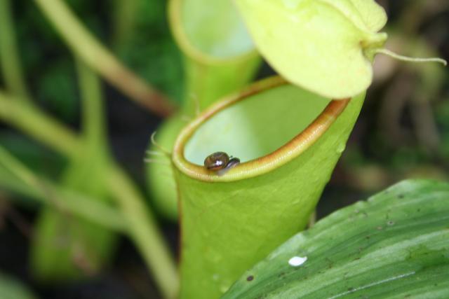
I noticed this little snail crawling along the razor's edge while we browsed the Atlanta Botanical Garden. One slip the wrong way, and this tiny guy would end up in a very unpleasant ending.
Technical Data: Canon EOS Digital Rebel XT, Canon EF-S 18-55mm f/3.5-5.6 II at 55mm, 1/60 sec at f/5.6, ISO 400. No post production. Atlanta Botanical Gardens, Atlanta, GA.
I am going to skip the full critique of this photo. It lacks tack sharp focus due to the lack of the use of a tripod. I'm sure there are plenty of other things I could find wrong with it if I tried, but I like this photo a bit too much to tear it apart.
If anyone cares to critique it a little more, feel free to do so in the comments - I know I said I didn't want to critique it, but I'm always interested to hear what others think of some of my photos.
- Bill
Green Frog Close-up
ktuli — Sun, 07/11/2010 - 20:13
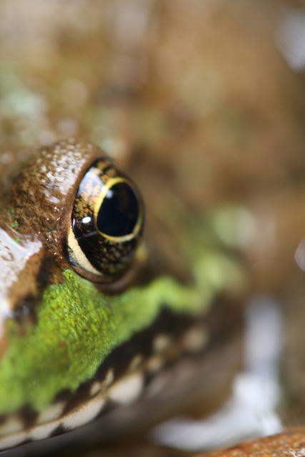
I stumbled upon this green frog (Lithobates clamitans) while hiking along in Linn Run State Park. I was actually hiking along the stream bed and had startled a couple of these frogs into hiding before I refined my technique to more carefully approach the frogs to get close enough to get some close-ups.
I was shooting handheld that day, and at this point was standing in about a foot of water and was holding the camera level with the surface of the water about six inches above the water, so I was not able to look through the viewfinder. Every once in a while, I intentionally shoot without using the viewfinder just try different angles and perspectives.
Technical Data: Canon EOS Digital Rebel XT, Tamron 180mm f/3.5 Di SP LD 1:1 Macro, 1/60 sec at f/4.5. ISO 400. No post production. Linn Run State Park, Rector, PA.
Why This Photo: This frog actually had some defect with its right eye - almost like a cataract - that made it cloudy and white. After a couple other shots, I decided to eliminate the problematic eye and try for this shot with only the good eye. It took a few shots to get the framing right without using the viewfinder, but eventually I came up with this.
What Works: The framing of this shot seems to work just right for me. The eye of the frog rests on one of the vertical thirds of the shot, and the green along its face produces a nice diagonal that draws the viewer's eye into the photo. Also pleasing is the shallow depth of field and the area of focus right at the frog's eye.
What Doesn't Work: If I could have used a tripod and managed a longer shutter speed, then a smaller aperture for more depth of field may have made for a nicer photo by showing off more of the texture of the frog's skin.
I have submitted this photo to the Photographic Section's Digital Projected Image Competition in 2010 as well as the George W. Glennie Memorial Nature Salon 2010.
I really do need to get out on some more photo excursions soon.
Leave me a comment and let me know what you think of this photo.
- Bill

