landscape
Bali: Uluwatu Temple & Kecak Fire Dance
ktuli — Wed, 02/09/2011 - 21:03
I'll be deviating from the normal method of doing things for the photos from this trip. There are far too many photos and too much background information for each photo to try posting them individually. The posts will likely be longer than normal, but will likely contain more photos and less technical discussion (though there will still be some - this is a photography site after all!)
Our trip began in Bali, Indonesia after a total of 28 hours of travel time and a 13 hour timezone adjustment. We got into Denpasar in the wee early morning hours on Jan 22nd, made our way to our hotel - the Puri Santrian resort (perhaps more on that in another post) - and crashed for a few hours. We spent the morning and afternoon lounging around the hotel, some folks hopped into the beautiful pool, while Anya and I strolled the grounds taking photos (of course!).
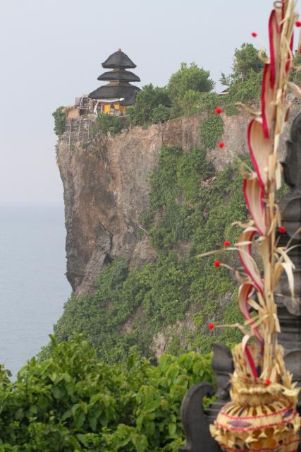
Towards late-afternoon, we headed off to the beautiful Uluwatu Temple (Pura Luhur Uluwatu). Uluwatu is a directional temple in Bali's south-west region which is meant to guard Bali from evil spirits. The temple sits up at the very edge of a 250 foot cliff that overlooks the Indian Ocean.
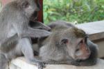
One of the major residents of the temple are monkeys. And apparently, these are thieving monkeys. The general setup is this: Tourists come, monkeys steal stuff from tourists, tourists buy fruit from vendors, tourists bribe monkeys with fruit to get their stuff back. Luckily we didn't have anything stolen, though Brigette apparently almost lost a fistful of hair when a monkey attempted to steal her hair band.
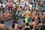
After visiting the temple and taking in the view from the cliffs, we proceeded to the Kecak Dance (or Ramayana Monkey Chant, or Fire Dance) nearby. The Kecak Dance is kind of interesting as it was basically invented by a couple westerners as a way to present some Balinese culture in a way that would appeal to westerners' limited tastes.
As usual, mouse over the thumbnails for the larger image to display.
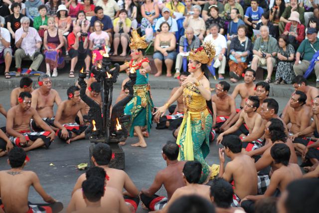
The dance consists of a circle of men who chant all of the "music" for the dance (visible in the shot second from the left above). They repeat a few sounds over and over, sometimes alternating sounds between different sections of the group. There are no musical instruments or spoken words to the story depicted in the dance, so the chanting provides the rhythm and marks the important events in the story.
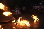
At the end of the dance, they set up a bunch of piles of what I thought was shredded coconut husks and set them on fire, and the monkey character then gets to kick them around (as depicted in the shot to the far right). It wasn't quite what I expected when I was told we were going to a "fire dance" - I think I was thinking of something more Hawaiian with a guy twirling a flaming baton, but this was still entertaining and impressive.
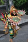
For the dance (and whole trip), I was limited in the lenses I was able to use. I switched between the Canon EF 50mm f/1.8 II and my new Canon EF 100mm f/2.8L Macro IS USM. I wanted the wide apertures (f/1.8 and f/2.8) to help with faster shutter-speeds given the twilight and then dark conditions. Also during the dance, I switched to automatic ISO mode, to allow the camera to select higher ISOs to also allow for faster shutter-speeds. I found that I took a good deal of photos in a vertical orientation (see below) as a way to both capture more of the character's full costume as well as a way to eliminate clutter and unnecessary elements (ie: spectators). If you're interested in any of the specific technical data for any shots here, simply post a comment and I'll provide them.
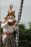
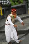
I am not going to go into the roles of each character, but provide some photos of each. Above there is a photo with two characters who basically provided comic relief, and I swear the one looks like Predator! Others include the Monkey, a bird of some sort, and others (see below). The costumes were really interesting, and you can see my usage of the vertical format to be able to isolate a single character.
 |
|
|
 |
||
 |
||
 |
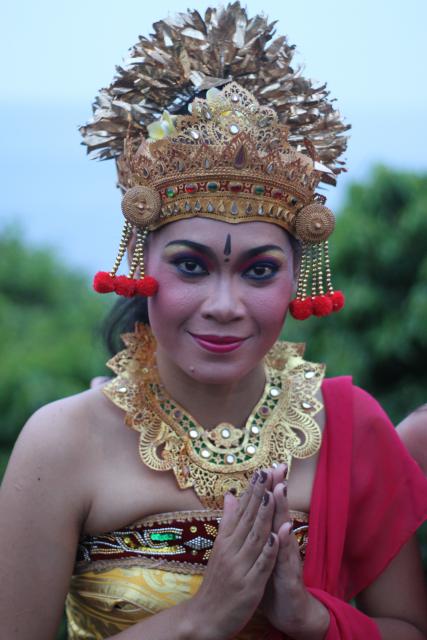
The last photo there - of the one female dancer - is Anya's favorite of this set. The wide aperture (f/1.8) on the 50mm lens used provides the nice soft background. Additionally, the vertical format allowed me to isolate the woman in the shot while she was flanked by tourists, all pushing to get their own photos alongside the performer.
Given the dim lighting and general disarray and constantly moving subjects, all of these shots came out fantastic. So remember the lessons here. Shorten your exposure time (faster shutter speed) as much as possible by (1) using as wide of an aperture as possible, (2) if your camera works well at high ISOs, switch to auto-ISO mode. Additionally, remember that sometimes the vertical format will help you to eliminate distracting elements from your photos, so rotate the camera and see what you can get.
- Bill
Indonesia: Sneak Peek (part 1)
ktuli — Thu, 01/27/2011 - 08:34
Ok - I don't know how many of these I will get around to posting (dive trips are always insanely busy vacations). So far, I've rattled off just under 3000 frames - granted, a large percentage of them will be culled, but it is still a lot of photos.
I'm six dives in with working with my 7D in the Ikelite housing, and I've been learning more and more each dive. I don't have an of those to share just yet, but for now, here's a couple shots...
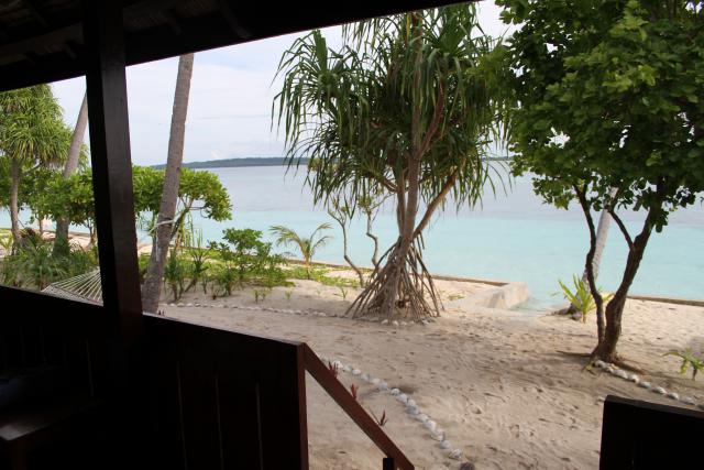
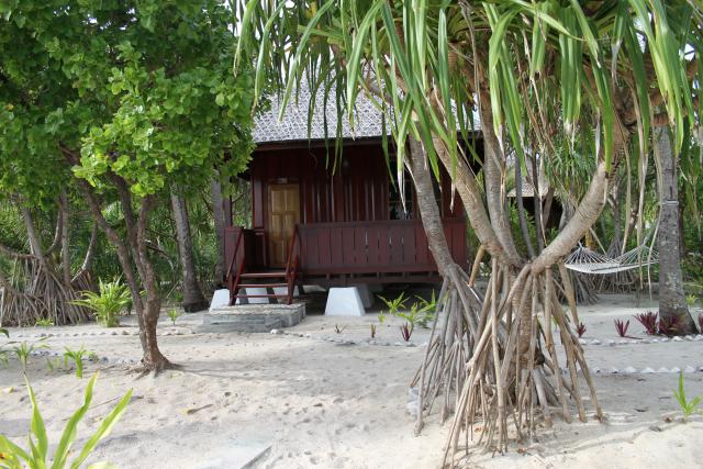
Enjoy!
- Bill
Poll: Top Third or Bottom Third
ktuli — Sun, 11/21/2010 - 19:32
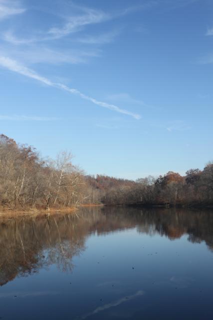
I usually don't do polls so close together, but I wanted to share these and gather opinions on whether folks liked more water or more sky.
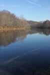
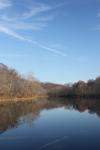
I know I've mentioned it repeatedly in my critiques of shots, but I don't know if I've specified what exactly is mean when I refer to 'the thirds'. Imagine drawing a tic-tac-toe grid on your photo (or in your viewfinder when composing your shot). One thing to look at is whether any lines work well along one of those grid lines - an easy one is your horizon in landscape photography like this. Another way to look at those grid lines is where they intersect - placing one of your main focal elements at that point is generally considered. This is usually referred to as the Rule of Thirds even though it is more of a suggestion than a rule.
 |
||
Both Photos Technical Data: Canon EOS 7D, Tokina AT-X M35 Pro DX AF 35mm f/2.8 Macro 1:1, 1/12 sec at f/22.6. ISO 200. Circular polarizing filter. No post production. Cedar Creek Park, Westmoreland County, PA.
I know these shots are not 100% identical left-to-right as I think I had to sidestep some low hanging tree branches to get the bottom third image, but I think it serves to show the difference between the placement of the horizon (or in this case the water level) on the top or bottom third.
You know the drill - place your vote, then leave me a comment to let me know what made you vote the way you did.
- Bill
Skipping Stones Sequence
ktuli — Fri, 11/19/2010 - 07:51
I don't feel much like typing much again today, so you get to benefit by getting to look at photos without a bunch of blabbering on and on.
Just mouse of the thumbnails to see the larger image.
Technical Data: Canon EOS 7D, Canon EF 50mm f/1.8 II, 1/1580 sec at f/1.8, ISO 200. Dolica AX620B100 tripod. Satechi TR-A Timer Remote Control Shutter Release. No post production. Cedar Creek Park, Westmoreland County, PA.
Enjoy.
- Bill
Cedar Creek Waterfall (part 2)
ktuli — Thu, 11/18/2010 - 21:52
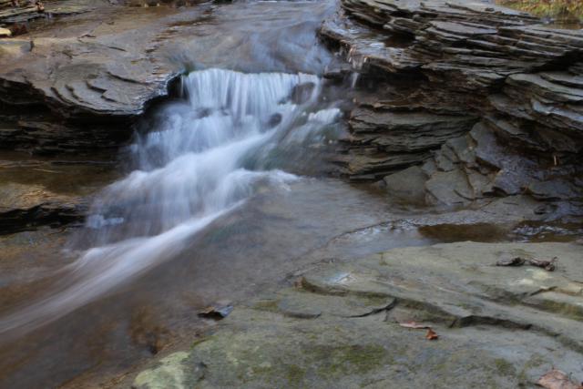
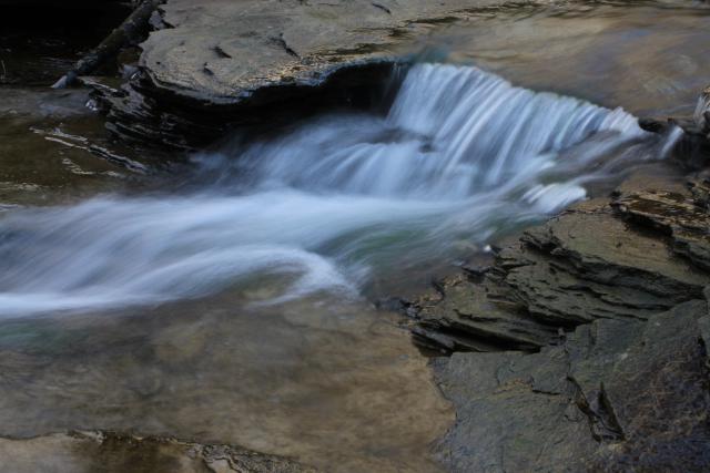
I guess to call this a waterfall is a bit of a stretch, but I'm not sure what else to call it. Regardless, here are several more angles of it.
All Photos Technical Data: Canon EOS 7D, Tokina AT-X M35 Pro DX AF 35mm f/2.8 Macro 1:1, 1/3 sec at f/22.6. ISO 200. Dolica AX620B100 tripod. No post production. Cedar Creek Park, Westmoreland County, PA.
I know the middle one is pretty similar to yesterday's, but they are different angles. I like how each shot is different and has its own feel. Pick your favorite and drop me a comment with your critique.
- Bill
Cedar Creek Waterfall (part 1)
ktuli — Wed, 11/17/2010 - 19:11
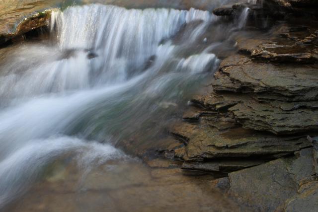
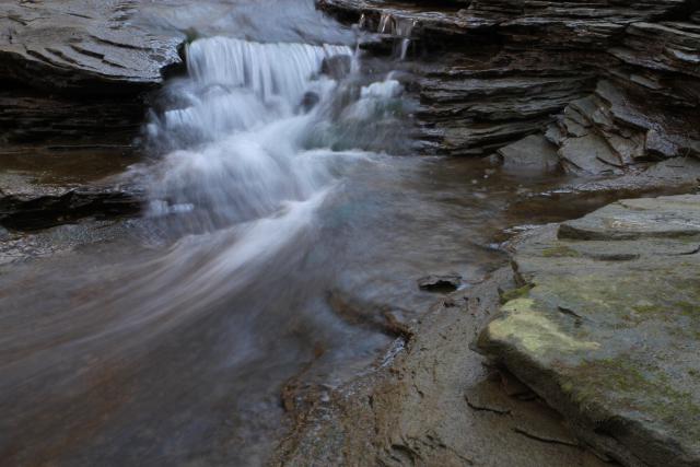
Technical Data: Canon EOS 7D, Tokina AT-X M35 Pro DX AF 35mm f/2.8 Macro 1:1, 1/3 sec at f/22.6. ISO 200. Dolica AX620B100 tripod. No post production. Cedar Creek Park, Westmoreland County, PA.
Why This Photo: I was trying multiple angles of this small waterfall, this may be my favorite (maybe... I keep changing my mind).
What Works: The relatively long shutter speed worked to produce the soft, blurred stream of water, and the composition produces a very nice balance of the elements in the photo. The large flat rocks in the foreground provide a nice starting point for the viewer's eyes, leading into the striated layers of the rocks further back which curve the direction of the photo to the waterfall which rests nicely on one of the thirds. The water itself being the main focus of the shot produces a final line back out of the shot with the interesting curve of the water's path.
What Doesn't Work: Honestly, the image seems fairly monochrome (perhaps it would be better as a full black and white job). A splash of color might have brought some more "life" to this photo.
Like I said, I have several other angles of this small waterfall to share, so perhaps I'll get to them soon. For now, leave a comment and let me know what you think of this shot.
- Bill
TTV Model Train and Orchids
ktuli — Thu, 10/28/2010 - 18:51
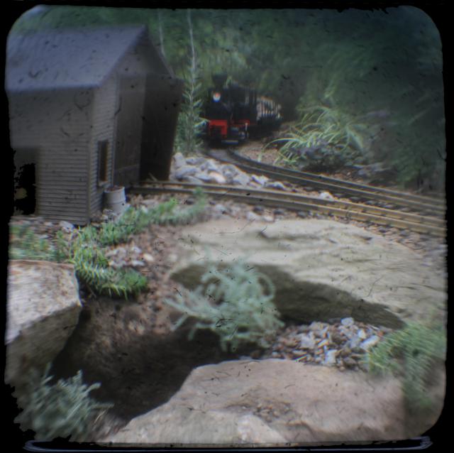
Ok - as promised, no lengthy discussion about the details of TTV photography. We'll take a look at two recent TTV shots, and go through my usual critique of them.
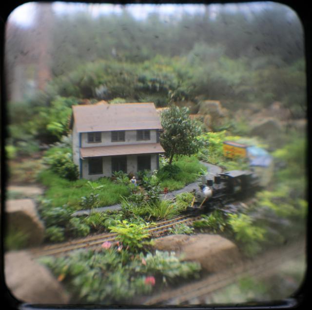
Technical Data: Canon EOS 7D TTV Argus Seventy-Five, Tokina AT-X M35 Pro DX AF 35mm f/2.8 Macro 1:1, 1/50 sec at f/4. ISO 200. Monopod and handheld. Cropped in Photoshop Elements 8.0. Phipps Conservatory.
Why This Photo: The model railroad display at Phipps made for many opportunities that begged for the TTV vintage treatment, this shot would probably look incredibly flat and boring with regular photography, but pops with TTV.
What Works: The focus hits right on the house and the front of the engine of the train. With the distortion of the viewfinder, getting this right isn't always as easy as with a regular shot. The distortion and blurred edges almost allows this shot to be mistaken for a real scene as opposed to a miniature setup.
What Doesn't Work: This exposure is a little bright for my tastes with this style of photography, and the blown out hot spots along the top are a bit distracting. The area of focus may have been better suited if it were shifted slightly to the right to get more of the train in focus.
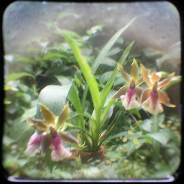
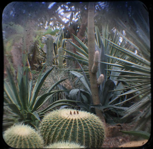
Technical Data: Canon EOS 7D TTV Argus Seventy-Five, Tokina AT-X M35 Pro DX AF 35mm f/2.8 Macro 1:1, 1/2 sec at f/8. ISO 200. Monopod and handheld. Cropped in Photoshop Elements 8.0. Phipps Conservatory.
Why This Photo: I liked the idea of old style photos of flowers - almost as if I was out on an expedition back when this Argus camera was just released and exploring and photographing this flower for the first time. I know - I have quite the imagination.
What Works: I love the balance the flowers give with two on one side and one on the other, and the colors really pop in this shot.
What Doesn't Work: The shot is way too over-exposed, and that is unfortunate because the long shutter speed of 1/2 second definitely added to the blur and lack of focus in the shot. Though the colors are nice, they're probably washed out because of the over exposure. The framing of the shot may have worked better to move the orchids up a little in the frame and reducing the empty space towards the top.
I still am just so pleased with this "new" style of photography, and am definitely looking forward to heading back out with this rig. But I do have a good handful more photos from this trip to Phipps, so I'll continue sharing them (I think I still owe you for that sleeper of a post yesterday! ;) haha!)
What do you think? Are you a fan of this TTV stuff? Drop me a comment and give your own critiques of the technique and these photos.
- Bill
Some More TTV
ktuli — Tue, 10/26/2010 - 21:15
I apologize for not getting a post in yesterday - between uploading the photos and then starting to crop them and then heading to my photography class, I just didn't have time to post. However, I finished the rest of the cropping tonight, and will give you a couple more samples of TTV goodness, and then tomorrow I'll try and get some real posts written.
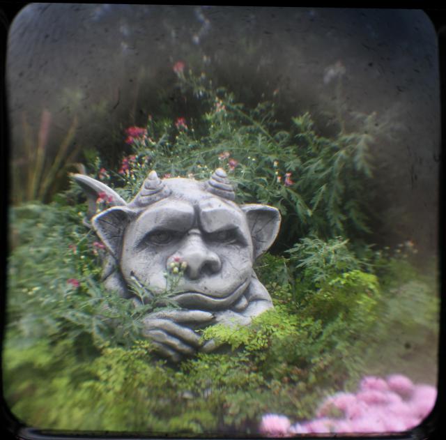
Technical Data: Canon EOS 7D TTV Argus Seventy-Five, Tokina AT-X M35 Pro DX AF 35mm f/2.8 Macro 1:1, 1/25 sec at f/6.4. ISO 200. Monopod and handheld. Cropped in Photoshop Elements 8.0. Phipps Conservatory.
Technical Data: Canon EOS 7D TTV Argus Seventy-Five, Tokina AT-X M35 Pro DX AF 35mm f/2.8 Macro 1:1, 1/40 sec at f/5.7. ISO 200. Monopod and handheld. Cropped in Photoshop Elements 8.0. Phipps Conservatory.
Technical Data: Canon EOS 7D TTV Argus Seventy-Five, Tokina AT-X M35 Pro DX AF 35mm f/2.8 Macro 1:1, 1/21 sec at f/9.1. ISO 200. Monopod and handheld. Cropped in Photoshop Elements 8.0. Phipps Conservatory.
The last one was shot by Anya, and after I let her have the rig, I didn't get it back the rest of the day... it is just that much fun to do this kind of photography.
Tomorrow, we'll take a look at how to build the contraption and discuss more details about what exactly all this is.
Stay tuned!
- Bill
Fisheye view of a Tree
ktuli — Sat, 10/23/2010 - 20:12
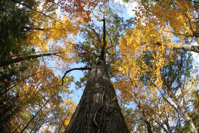
Last weekend, my friend, Tom loaned me his Sigma 10mm Fisheye lens. So we decided to take a trip out to Ohiopyle.
I have always found trees to be very intriguing - yet almost impossible - subjects. There is just something about photographing trees that I struggle with, but I keep trying. In fact, I have some specifically tree photo projects simmering on the back burner, so hopefully some day they'll see the light of day and I can share them here.
In the meantime, let's look at this tree through a fisheye lens...
Technical Data Canon EOS 7D, Sigma 10mm f/2.8 EX DC HSM Fisheye (borrowed), 1/12 sec at f/22.6. ISO 200. No post production. Ohiopyle, Fayette County, PA.
Why This Photo: As I said, I am intrigued by photography of trees, and I like this perspective giving the full feeling of the size of the tree. Also, using the fisheye lens, gives a very interesting perspective with the surrounding trees. When I saw this tree off the side of the trail, I knew it was worth trying to shoot.
What Works: Despite ignoring the rule of thirds and placing the trunk of the tree dead center, I like this layout composition. Also, though the distortion of the fisheye is constant in the frame, the placement of the surrounding trees actually does a good job of making it appear offset slightly to the top of the frame.
What Doesn't Work: The lighting was tough with fairly quick moving clouds shifting the brightness of the scene repeatedly and with little warning - thus the frame is not evenly lit and the colors are not as nice as they could be. Also, I wish there was more variety in the colors in the leaves, but then again, I guess I don't get much control over that.
Unfortunately, I had another shot I really wanted to get on this trip with this lens. I don't want to give away the details because I have a whole project I want to try and start up that is related, so I'm going to be a little vague here. But there is what I would call an iconic subject out on Route 51 that I wanted to photograph only to find it was covered with some very offensive graffiti. I knew there was graffiti, and that was part of the attraction to it - I was hoping that it would help to make the photo more engaging, so you can imagine my disappointment. I am still hopeful to eventually figure out a way to get the photo I planned without the offensive elements, and then I'll have to borrow that fisheye lens again.
- Bill
Rough Morning on the Water
ktuli — Sun, 10/03/2010 - 22:08
I could use a morning spent like this... choppy water or not. What do you think?
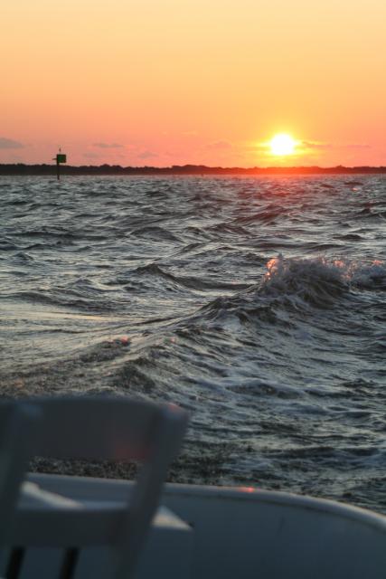
This photo was taken around this time two years ago on an early morning fishing trip on the Outer Banks in North Carolina. This used to be a favorite and regular vacation spot for us, but we haven't been there recently.
Technical Data: Canon EOS Digital Rebel XT, Canon EF 80-200mm f/4.5-5.6 II at 80mm, 1/800 sec at f/5. ISO 400. No post production. Cape Hattaras, NC.
Why This Photo: We were out on the boat before sunrise, so as the sun came up over the horizon, I clicked of a round of photos. On the rocking boat deck, most were throw-aways, but I did bring home a couple keepers. We brought home some fish for dinner too.
What Works: The composition uses the rule of thirds with the horizon on the upper third, and the boat deck chair reaching to the bottom third. Additionally, the sun and the prominent wave hit on the right third. The warm sunrise color is a beautiful contrast to the cool blue water. The crisp focus hits right on the whitecap of the wave, and probably most surprising to me is the horizon is actually level!
What Doesn't Work: I unfortunately was at the widest focal length of this zoom lens, and I couldn't really back up, but it would have been nice to have gotten more of the boat in the shot to make it more obvious that the shot was taken from the boat - perhaps a lower angle would have worked. Also, a deeper depth of field might have been nicer - with the full sunlight into the shot and the fast shutter speed (1/800th sec), I could have used to crank up the f/stop (except I didn't even know what an f/stop was back then).
So I could use another morning like this... both to get another chance to make another photo better, and just because it would mean I was on vacation. And I could certainly use both of those things.
- Bill

