photoshop
Poll: Black Sea Rod Cropping
ktuli — Thu, 01/13/2011 - 17:50
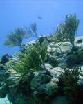
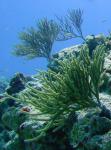
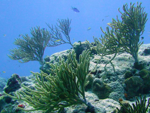
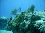
Ok - that last post reminded me that I promised to share different cropping options for the 'winner' of that poll. So here we go... Three fairly different crop options with the color corrected version of the photo. As usual, mouseover the thumbnails for the larger image to display.
|
|
|
|
|
|
||
Hopefully by now, you know how this works... choose your preferred version below, then leave a comment with why you chose what you chose.
Thanks for stopping by!
- Bill
PS: I do have to admit that I removed the small Blue Chromis from the upper edge of the second version as it was actually cut off by my preferred crop line, and rather than move the crop line, I used the spot heal tool to remove the half fish leftover.
Some More Underwater Photoshopping
ktuli — Tue, 01/11/2011 - 20:45
Sorry - these photos are not from the new Ikelite equipment or even from our new SeaLife DC1200 compact camera. They actually came from a rented SeaLife DC800 camera during our trip to Cozumel, Mexico last summer.
All the work preparing for the upcoming trip to Wakatobi in Indonesia and working with the new Ikelite gear for the 7D and reading up on dive photography has me thinking about these old photos. More specifically, it has me thinking about whether I can salvage anything from these old photos that didn't turn out so well (and perhaps to prepare for any adjustments I'll have to make to any new photos I come home with.
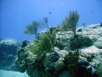
Surprisingly, all I did with these photos was to run them through the Auto Color Correction and Auto Smart Fix. Pretty easy, but the results are fairly impressive. The second photo was cropped slightly as well.
Mouseover each image for the original to compare...
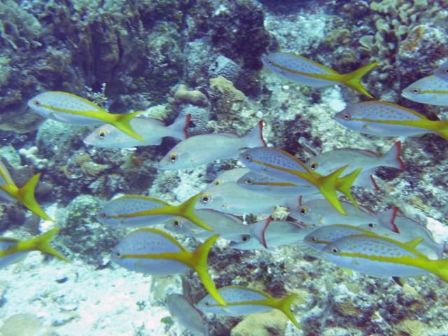
Technical Data: SeaLife DC800 at 13.8mm, 1/80th sec at f/4.7, ISO 64. No Flash. Auto Color Correction, Auto Smart Fix in Photoshop Elements 8.0. Colombia Shallows, Cozumel, Mexico.
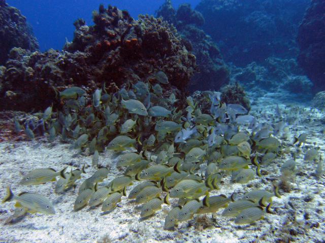
Technical Data: SeaLife DC800 at 4.6mm, 1/160th sec at f/5.3, ISO 64. No Flash. Cropped, Auto Color Correction, Auto Smart Fix in Photoshop Elements 8.0. Colombia Shallows, Cozumel, Mexico.
The top photo is of a group of Yellowtail Snapper (Ocyurus chrysurus) while the second shot is of a school of Blue-Striped Grunts (Haemulon sciurus - at least I think so.
Hopefully I don't have to do any post production work on the photos I bring back from this upcoming trip, but if I do, hopefully they are as easy as these!
- Bill
Poll: Black Sea Rod
ktuli — Mon, 12/13/2010 - 19:59
I have started receiving some of my Christmas presents to myself... I've been ordering some camera gear to make my upcoming trip to Indonesia much nicer. Stuff to try some night time-lapse, as well as to take my EOS 7D diving with me. But I'll get into all of that later.
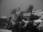
All the research I've been doing to get the gear necessary to take my 7D diving has had me looking at different underwater photos, and a lot of places suggest black and white conversions. So I figured I'd give it a shot myself.
|
|
||
Technical Data: SeaLife DC600 at 5.4mm, unknown shutter speed at f/2.8. ISO 64. No flash.
All of the research for underwater camera equipment really has me chomping at the bit to get back into the water. Hopefully I'll be able to come back with some higher quality dive photos.
If my coral identification skills serve me right, this is Black Sea Coral (Plexaura homomalla) which is a branch yellowish gorgonian coral. It is fairly common around the reefs in Cozumel. The wide angle view of the original shot produced that typical blueish cast to the shot (remember, light travels much slower in water, and red color is the first to disappear).
With that in mind, I figured I'd try a quick bit of color correction on the photo as well as provide the black and white treatment. Place your vote, and leave a comment on why you chose what you did.
- Bill
PS: Working with this photo made me also consider some possibilities with cropping options, so perhaps once we have a "winner" of this poll, I'll run that version through some crop options to see what we can get out of that.
PPS: Also, stay tuned as I'll try to get myself back into a routine of posting by discussing the various equipment I bought myself for Christmas... ;)
Another Spot of Photoshopping
ktuli — Sat, 10/09/2010 - 10:42
Alright, we'll take a little break from the bees and flowers and take another look at some more recent photoshopping work.
I shared this photo once before, and while I really like the photo, it needed a few very minor touch-ups to be ready to for the Photographic Section's Digital Projected Image Competition.
If you hover your mouse over the image, it will show the original. You'll see that all I did was use the spot healing tool to clean up the water spots and a single rust spot. While those spots weren't necessarily distracting in the original, I think you'd have to agree that removing them certainly makes the shot much nicer.
If you're interested in more discussion on this photo, head on over to the original post.
- Bill
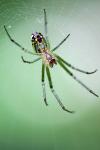
Kanawha State Forest Spider: Redux
ktuli — Mon, 10/04/2010 - 16:01
If you have been following along, you know that I am not big on photoshopping my photos very much. Partially this is because I'm a purist and would rather get the "perfect" shot right with the camera, partially because I generally feel I do a bad job when trying to use Photoshop, and partially because I really hate poorly and obviously photoshopped images.
But the other day, I was able to take one of my all-time favorite photos I've ever taken and make it better with several small adjustments with Photoshop Elements.
The photo in question is one in a set of photos taken of a cool looking spider we had found in Kanawha State Forest near Charleston, WV. I debated saving this modified version to discuss sometime in the future when I needed a post to get me going, but between the good results I got and really liking the nice mouseover trick I found recently, I just couldn't wait.
 |
Original Image | 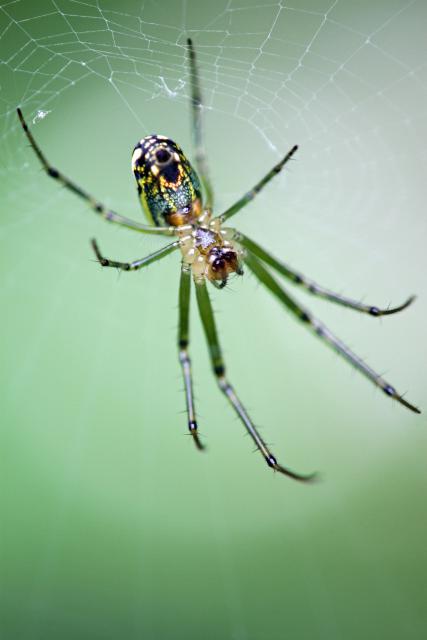 |
 |
Auto Adjusted | |
 |
Spot Heal tool on thorax to remove hotspot. Darken highlights 50% on abdomen. | |
 |
Clone Stamp tool used to touch up leg that touched right edge of frame. |
As you can see, the adjustments are very minor, and if you didn't know they happened, you probably couldn't even tell. Heck - some of them, you'll probably have to look very closely to see the difference between the two images when they're displayed even like they are here (I find myself sliding my mouse back and forth over the thumbnails to have the change flip back and forth on the larger image). But to me, that is a successfully photoshopped image - one where you can't even tell that photoshop was used.
I am submitting this photo to an upcoming Photographic Section digital projected image competition, so we'll see how my minor adjustments do. I with I could submit both photos and see which one scored better to see whether the edits were worthwhile.
Regardless, I managed to take one of my favorite photos and make it that much better. I'm glad I didn't have this one printed and framed yet, because it definitely would have to be redone with this new version!
- Bill
Hockey Cropping
ktuli — Wed, 09/22/2010 - 19:57
Well, after a power outage right when I was coming home from work that threw off my schedule for a bit, I'm now sitting on the sofa, relaxing and listening to the first preseason Pittsburgh Penguins hockey game. If you know me, you know hockey is something very important to me - both watching and playing it.
The return of the hockey season is something I've been looking forward to since May 12, 2010. It was big enough that it inspired me as to what to post this evening.
So I looked through my old photos, and I found a set of photos I took three years ago to the day. Oddly enough, it was also a preseason game against the Detroit Redwings.
These shots were taken at the Mellon Arena (which I will always know as the Civic Arena), and I managed to sneak in my Rebel XT with the Canon EF 80-200mm lens attached. Technically, the Civic Arena had a policy that lenses had to be no longer than three inches in length. And unfortunately, the Consol Energy Center has a policy that prohibits all cameras with interchangeable lenses.
As a result, tight photos from a fan's seat might be harder and harder to get. So you just might end up having to crop photos down to get nicer shots. Which is exactly what we'll look at today...
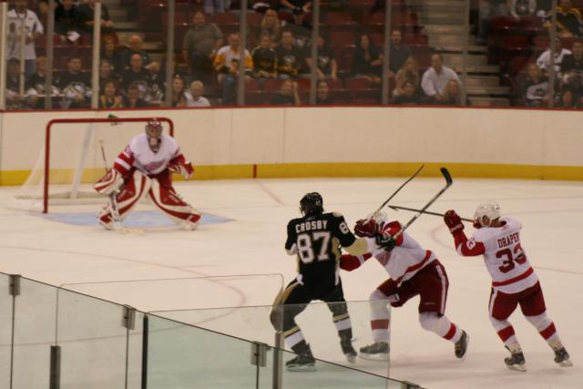
Technical Data: Canon EOS Digital Rebel XT, Canon EF 80-200mm f/4.5-5.6 II at 100mm, 1/200 sec at f/5. ISO 400. Cropped in post production. Mellon Arena, Pittsburgh, PA
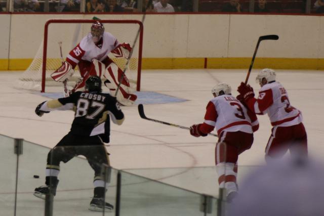
Technical Data: Canon EOS Digital Rebel XT, Canon EF 80-200mm f/4.5-5.6 II at 100mm, 1/320 sec at f/5. ISO 400. Cropped in post production. Mellon Arena, Pittsburgh, PA
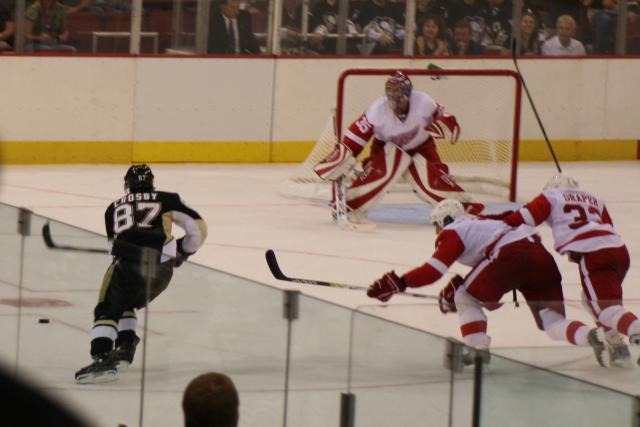
Technical Data: Canon EOS Digital Rebel XT, Canon EF 80-200mm f/4.5-5.6 II at 100mm, 1/200 sec at f/5. ISO 400. Cropped in post production. Mellon Arena, Pittsburgh, PA
If you mouseover the images, it should load the original, giving you an idea of how much the cropping cleaned up the final product. I probably could have used some effort to remove more distracting elements from the second and third images, but I was just doing a quick crop on these images.
So remember - even if you don't have that super-long telephoto, or you just want to leave your original composition a bit loose so you don't leave out important elements by cropping too closely on your actual shot - especially when shooting quick moving action, you can always go back later and crop things down a bit to get that close shot you're looking for.
Leave a comment and let me know what you think. What is your opinion of cropping in camera versus in post production.
Now, if you don't mind, I'm going to listen to the rest of the game... GO PENS!
- Bill
Poll: Cropped Blue Dasher
ktuli — Thu, 09/02/2010 - 19:35
Alright - bear with me for one more dragonfly photo, and then I'll switch it up.
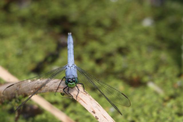
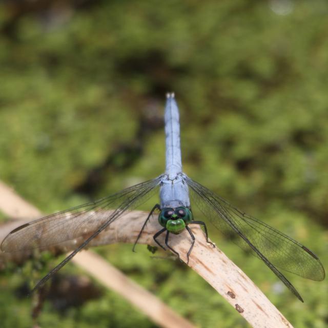
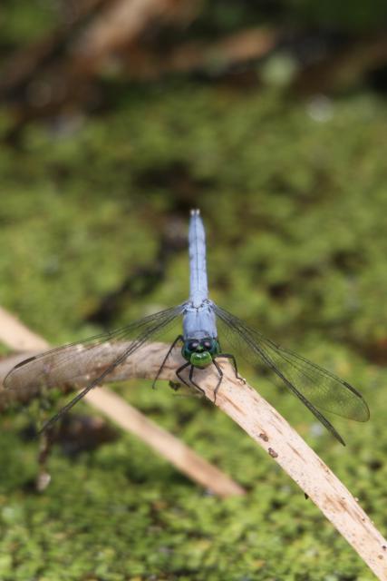
So today, we'll look at several different crops of the same photo. The subject is a Blue Dasher (Pachydiplax longipennis) that I saw while at Raccoon Creek State Park.
Technical Data: Canon EOS 7D, Sigma 150-500mm f/5-6.3 APO DG OS HSM at 500mm, 1/260 sec at f/8. OS mode 1. ISO 200. Dolica AX620B100 tripod mounted. No post production. Raccoon Creek State Park, Beaver County, PA.
I honestly originally thought that I would like the square crop the best - I'd recently read an article in one of my photography magazines about the virtues of a square crop. However, after seeing them all together, I honestly am not sure which crop I like best. I'll have to debate a bit before deciding.
Place your vote and leave a comment to let me know why you feel the way you do.
- Bill
Spider Strike Cropping
ktuli — Tue, 06/01/2010 - 20:23
So while we're on the subject of different framing, let's talk a bit about cropping to give yourself more framing options.
This is something I'm quite often guilty of not paying attention to, and unfortunately my error is usually in the sense that I crop too tightly in my original photograph (often cutting an element off) and not allowing myself room for software cropping later.
For this photo of a spider pouncing on its prey, I managed to leave myself room to crop...
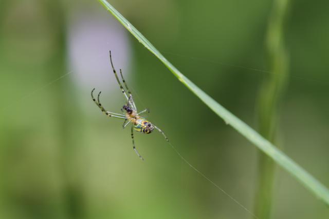
Technical Data: Canon EOS 7D, Tamron 180mm f/3.5 Di SP LD 1:1 Macro, 1/21 sec at f/8. ISO 200. Dolica AX620B100 tripod. No post production. Kanawha State Forest, Charleston, WV.
After reviewing at home on the computer, I felt the image lacked impact with the spider being small within the frame. So I fired up Photoshop to see what cropping possibilities there were...
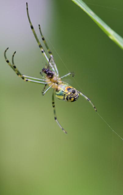
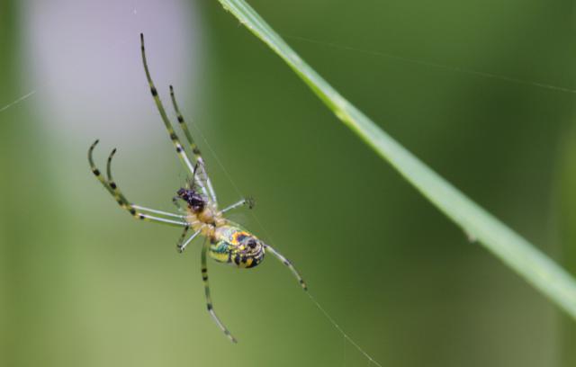
I am not entirely sure how I feel about the stem of grass in the vertical crop, but I didn't want to remove it and modify the image much for this discussion. However, the grass works just fine in the horizontal crop.
In general, I'm not really one to do much post production editing to my photos. I don't know if it is a perfectionism kind of thing, or just a dislike for edited photos (though one can argue whether simple cropping is much in the way of editing).
However, if I continue to find examples like this that open multiple possibilities from a single exposure, I may start turning that opinion around.
- Bill
PS: For a better view of this spider, check out my current favorite spider photo
Poll: Foray into Photoshop
ktuli — Sat, 02/27/2010 - 19:28
Normally I hate modified photos. In particular, I hate modified photos when you can tell the photo has been modified.
One of the presents Anya got me for Christmas was a copy of Photoshop Elements. At first, I wasn't sure whether I would use it much.
With my recent venture into entering various competitions, I've found the need to use it a bit more.
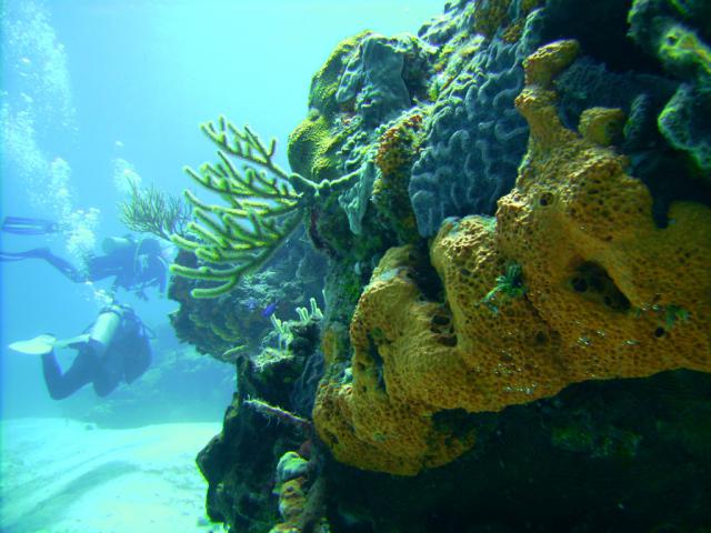
We have some photos from our dive trip to Cozumel, and I love them as photos, but their color isn't necessarily spot on.
So I modified the following photo to see if I could make the colors closer to what I remembered them to be like. Take a look at the original and the modified version below, and vote for which one you like better.
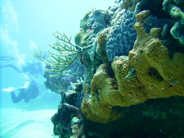
Unmodified
Modified
Unfortunately, I forget what exact changes I made (something I will try to be a bit better about recording in the future), but I know that I darkened the photo and adjust the contrast slightly. I also modified the colors slightly to remove a bit of the blue color cast that is typical of underwater photography.
The colors in underwater photography without a ton of flash is usually not accurate since the spectrum of light drops off the deeper you go. Did you know that? That is one of those things you don't really think about, but you learn when you get scuba certified.
Anyway - vote for which version of the photo you like better, and leave a comment to back up your vote.
- Bill

