Peek-a-boo Praying Mantis
ktuli — Wed, 08/03/2011 - 20:12
Alright - I had a whole post typed up and scheduled for today, but by special request, I've swapped it out for a later date in favor of this post.
Saturday morning, I was sitting at the computer reading my comics while Anya was out in the yard refilling the birdfeeders. Then she tapped on the window and told me to grab my camera and come outside.
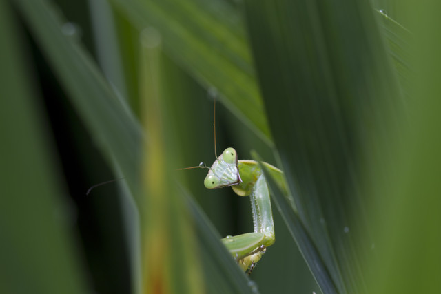
As it turns out, there was a Praying Mantis (Mantis religiosa) in her Uncle's garden which is just a couple doors down.
When I got there, it was tucked pretty far down in amongst some tall plants, and after a couple attempts to get a good angle, I saw this opportunity....
Technical Data: Canon EOS 7D, Canon EF 100mm f/2.8L Macro IS USM, 1/30th sec at f/8. Image Stabilization on. ISO 100. RAW conversion in Adobe Camera Raw.
Why This Photo: Since the mantis was doing such a good job of keeping track of me as I moved around the garden to find a shot, but the talk plants were in the way, I saw this opportunity to frame the shot through the plants. The almost playful, peek-a-boo expression on the mantis was just a happy coincidence.
What Works: The playful look to the shot brings a kind of easy light-heartedness to what otherwise would just be another macro shot of an "ugly" (at least according to most people, but not me) bug. Creative framing using the thick leaves of the plants takes advantage of what was otherwise a problem situation. The bonus of the drop of water on his antenna is icing on the cake.
What Doesn't Work: The focus may be just a tad off or there could be a slight amount of camera shake (that even the IS wasn't able to eliminate), but it is incredibly minor as the fullsize version still shows some of the facets in the mantis' compound eyes. Also, the bright leaves in the front (right and middle) are somewhat distracting.
Tune in tomorrow as I have a rather different set of photos to share, but stuff I really think will be cool.
Thanks for viewing.
- Bill
Pink Spotted Ladybug
ktuli — Tue, 08/02/2011 - 20:18
Have you ever seen a Pink Spotted Ladybug (Coleomegilla maculata)? Before last Sunday, neither had I.
Ladybugs are good insects to have in your garden. They eat aphids, and thus keep your plants safe. Most people are used to the orange variety, so when we found these pink ones, it was worth a few shots.
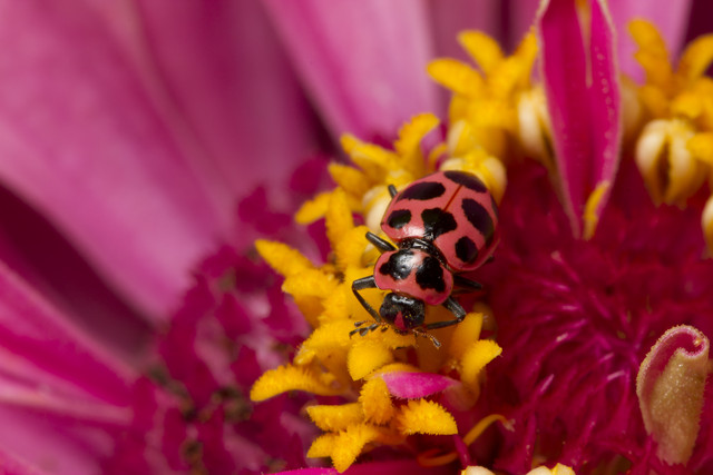
I'm not sure if that last one was really that color or if I messed something up during the RAW conversion. I don't remember it being that dark, but as you can see they seemed to be different shades based on what color flower they were on. I don't know if that is because they can shift their colors or if it is an optical illusion.
- Bill
The Smallest Spider I've Ever Seen!
ktuli — Mon, 08/01/2011 - 20:29
Ok - you were warned. I told you that we were getting back to the bugs and spiders today... well, the spiders at least for today.
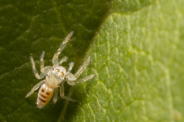
I saw this tiny little guy on one of the bushes out in our front yard. And when I say tiny, I mean like head of a pin tiny! Based on my calculations (which are this point are pretty much eyeballed) - this guy is about 2mm in size (maybe... and I do mean maybe... his legs could have reached 3mm fully stretched out). Despite the tiny size, I saw him make jumps of over 65mm! He was absolutely fearless.
This is the only shot of him that I managed to get, and unfortunately I wasn't able to find him again after running inside to get my tele-converter. I've cropped down to show a bit more of the detail (just mouseover to see the original version).
Technical Data:Canon EOS 7D, Canon EF 100mm f/2.8L Macro IS USM, 1/250 sec at f/16. Canon Speedlight 580EX II flash in auto mode and wireless control. Image Stabilization on. ISO 160. RAW processing and cropped in Adobe Camera Raw.
I know many people don't like spiders, but this tiny guy just fascinates me. The thought that there is a beating heart, a tiny brain, everything. It is just incredible. I don't know if this is a juvenile or a full grown adult (I still have yet to find a spider ID book worth buying), so I have no clue on the species here. Regardless, I really love those semi-translucent legs!
Come on... you have to admit that this tiny little guy is pretty cool... and at 2mm, he is absolutely 100% harmless to everything except those other pests in your garden that you don't want anyway!
Give spiders a chance.
- Bill
PVGP 2011 (part 5)
ktuli — Sun, 07/31/2011 - 20:58
Alright, I'm winding down with the Grand Prix photos - I still have some more to share, but I think I'll start mixing some bugs and spiders back in (sorry - I have a ton of them and I have to get to them sooner or later). So we'll just do an assortment of shots today.

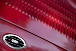
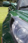
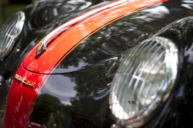
There's a nice assortment of some of the cars you can see at the PVGP. From left to right, you've got a Triumph, an MG (pretty obvious on those two), a Lotus (this is a modern version), a Porsche (again - modern), and a Jaguar. I'm not necessarily partial to any kind of cars when I go to the show, so I freely wander about and shoot whatever (except I'm not a big BMW fan).
I hope you've enjoyed the photos from this year's Vintage Grand Prix. I already have some ideas for what I want to get next year, so we'll have to see if I can remember!
Remember - tomorrow, we get back to the bugs and spiders.
- Bill
PVGP 2011 (part 4)
ktuli — Fri, 07/29/2011 - 20:28
Time to share my favorite shot from this year's trip to the PVGP. I don't know what it is, but like last year (original and modified) I seem to be drawn to the MG logo.
Technical Details: Canon EOS 7D, Canon EF 50mm f/1.8 II, 1/1600 at f/1.8. ISO 100. 2011 Pittsburgh Vintage Grand Prix, Pittsburgh, PA. Raw conversion and B&W conversion in Photoshop CS5 (mouseover for original).
Why This Photo: Like I said, I'm drawn to MG's for some reason, and when I saw the wheels on this particular one, I knew it was worth shooting.
What Works: First, the B&W conversion does wonders for this shot - the change is subtle, but almost vital (mouseover the image for the color version). The lines and curves that intermingle in this shot really give the viewer plenty to look at without ever getting stuck in any one place. Additionally, the placement of the center hub with the MG logo on it kind of breaks some rules, but does it very successfully I think - I will discuss further in a bit.
What Doesn't Work: There is a reflection on the middle-left that I only noticed just now. I'm actually debating another run through processing this - a friend showed me another version that I liked and want to attempt - so I may clone it out then. Also, the right side of the MG logo is just ever so slightly starting to blur due to the depth of field selected - but not enough to be a problem in my opinion.
So what was that about breaking rules?
Well, take a look at the line the face of the logo directs your eyes. Normally, that kind of angle would direct your gaze towards the right and out of the frame. I shared this shot on a forum and one member asked why I selected the placement of the logo to the right and not the left.
First off, take a look at the spokes behind the center hub with the logo - because of the DoF, they're blurred - and very nicely in my opinion. I liked that blur. However, if I put the hub on the right side of the frame, there was very little of the spokes in focus to the left, and their intricate pattern is just as vital to the shot as the logo. I looked at it like that through the viewfinder, but instantly nixed the idea. Plus, if the logo were on the left, the shot would have had to be more straight on to keep the wheel filling the frame, and that would have produced an entirely different look.
Getting back to the line that the face of the logo directs your eyes - normally it would be a bad idea to have something direct your viewer's gaze out of the frame... the whole point of photography is to get them to look at your photo. Luckily, in this case, the far edge of the wheel is at the edge of the frame and naturally produces a shift in your visual path. At least for me, my eyes hit that edge of the wheel and then turn and follow it up and around the top of the frame - eventually making my way back to the spokes that are in focus on the left side of the frame. From there, they wander around and eventually end up back at the center hug and logo. Surprisingly, this works even though the entire wheel is not in the frame but broken at the top and bottom - I think it is because our mind knows the shape that is there and fills in the missing parts for us.
I don't know - maybe I'm talking a load of rubbish (to steal a phrase from the British... since this is a British car after all), but give it a shot. Let your eyes wander around the frame and see where the lines lead you.
Drop me a comment and let me know what you think and whether your visual path is different through this photo.
Thanks for viewing.
- Bill
PS: Normally I refrain from getting that detailed about how my own visual path flows through a photograph - mainly because I want each viewer to find his or her own visual path through my photos. However, in this case, it really served a purpose to explain how in this case the rules can be broken and yet still produce an engaging photograph.
PVGP 2011 (part 3)
ktuli — Thu, 07/28/2011 - 19:16
Alright, just a quick post today... I'll just let the shot speak for itself. Mouseover for the black & white version.
Technical Details: Canon EOS 7D, Canon EF 50mm f/1.8 II, 1/640 at f/1.8. ISO 100. 2011 Pittsburgh Vintage Grand Prix, Pittsburgh, PA. Raw conversion and sepia tone conversion in Photoshop CS5 (mouseover for original).
Thanks for stopping by.
- Bill
PVGP 2011 (part 2)
ktuli — Wed, 07/27/2011 - 21:02
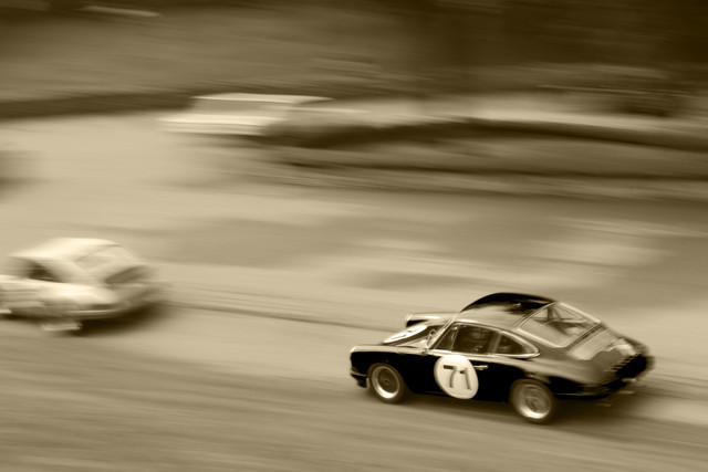
So one of the things I went into this year's Vintage Grand Prix hoping to accomplish is some panning shots. Basically, you keep one of the cars in the same spot within the view finder as you track along with the car as it moves. Doing this produces a blurred background with a sharp in focus car. The blurred background generally will have a streaked appearance, giving the sense of speed and motion. It is much easier said (and typed) than done!
I took probably at least 200 photos, and only got a couple that were worth keeping - and even those are a bit blurry and probably should be deleted... but for a first attempt, I figured they were good enough. And in one case, I used a sepia tone treatment to give it an even more vintage look (and to hide some flaws).
Technical Details: Canon EOS 7D, Canon EF 50mm f/1.8 II, 1/10 at f/22. ISO 100. 2011 Pittsburgh Vintage Grand Prix, Pittsburgh, PA. Raw conversion and sepia tone conversion in Photoshop CS5 (mouseover for original).
Obviously, unless all of the cars are moving at the exact same speed, only one will be in focus. In this case, I was focusing on the red 71 car. If you look closely at the 71 on the door, you'll see it is a bit blurred, and other parts of the car are not as crisp as I would have liked. This either means I panned too quickly, too slowly, and/or moved the camera up/down.
I think I chose a poor location to try this... as the cars would enter the turn, they would change speeds - making it much more difficult to pan at the right speed. It also produced a rather cluttered and confusing background.
But all in all, I still like the shot - despite its flaws, it was a good learning experience, it has a fun feel too it, and I enjoyed capturing it.
- Bill
PVGP 2011 (part 1)
ktuli — Wed, 07/27/2011 - 06:36
Ok! As promised, we'll take a break from the spiders and bugs for a bit and check out some classic cars. Like last year I took a trip to the Pittsburgh Vintage Grand Prix. Hopefully this year's shots meet your approval...
Technical Details: Canon EOS 7D, Sigma 150-500mm f/5-6.3 APO DG OS HSM at 289mm, 1/320 at f/6.4. ISO 100. 2011 Pittsburgh Vintage Grand Prix, Pittsburgh, PA. Raw conversion and cropped in Photoshop CS5 (mouseover for original)
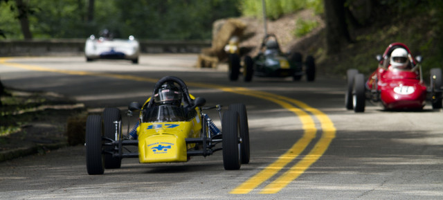
Why This Photo: I took shots from this vantage point last year too, and I really liked the way you could get multiple cars lined up in the shot. It obviously requires a little luck and patience and good timing.
What Works: The relatively shallow DoF allows for the main car to be in focus while the others are blurred. Additionally, the placement of the cars provides balance to the shot, while the curve of the road produces a pleasing smooth line to lead the viewer's eyes through the scene.
What Doesn't Work: Obviously, in the original, the over-exposed pavement at the foreground was very distracting. It really served no purpose, but as you can see, was very easy to eliminate. The exposure through the shade of the trees on that section of road is always a little tough. Additionally, the front tire of the red car is breaking the edge of the frame, and probably would have been better suited had it been given a little space there.
Stay tuned as I have a bunch of shots to share from the races and the car show... plus, in a rare twist for me, you'll see a bit more post processing - including some B&W and Sepia.
- Bill
Mating Damselflies
ktuli — Tue, 07/26/2011 - 07:12
Sorry - still haven't managed to process the PVGP photos, so another bug shot from Beechwood Farms.
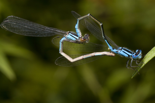
This is a pair of mating damselflies.
Technical Data: Canon EOS 7D, Canon EF 100mm f/2.8L Macro IS USM, 1/250 sec at f/16. Canon Speedlight 580EX II flash in auto mode and wireless control. Image Stabilization on. ISO 160. RAW processing in Adobe Camera Raw. Beechwood Farms Nature Reserve, Fox Chapel, PA.
I am hoping to get to the PVGP photos tonight, and if I finish early enough, I'll try to post at least one from that set. Stay tuned.
- Bill
Orange-Striped Caterpillar
ktuli — Sun, 07/24/2011 - 20:22
I have a ton of photos to process from this weekend, but honestly, right now I'm kind of exhausted. So just stopping by to share a cool caterpillar photo...
Technical Data: Canon EOS 7D, Canon EF 100mm f/2.8L Macro IS USM, 1/250 sec at f/16. Canon Speedlight 580EX II flash in auto mode and wireless control. Image Stabilization on. ISO 160. RAW processing in Adobe Camera Raw. Beechwood Farms Nature Reserve, Fox Chapel, PA.
Soon I'll have Vintage Grand Prix and a bunch more spider photos to share.
- Bill

