PVGP 2011 (part 4)
ktuli — Fri, 07/29/2011 - 20:28
Time to share my favorite shot from this year's trip to the PVGP. I don't know what it is, but like last year (original and modified) I seem to be drawn to the MG logo.
Technical Details: Canon EOS 7D, Canon EF 50mm f/1.8 II, 1/1600 at f/1.8. ISO 100. 2011 Pittsburgh Vintage Grand Prix, Pittsburgh, PA. Raw conversion and B&W conversion in Photoshop CS5 (mouseover for original).
Why This Photo: Like I said, I'm drawn to MG's for some reason, and when I saw the wheels on this particular one, I knew it was worth shooting.
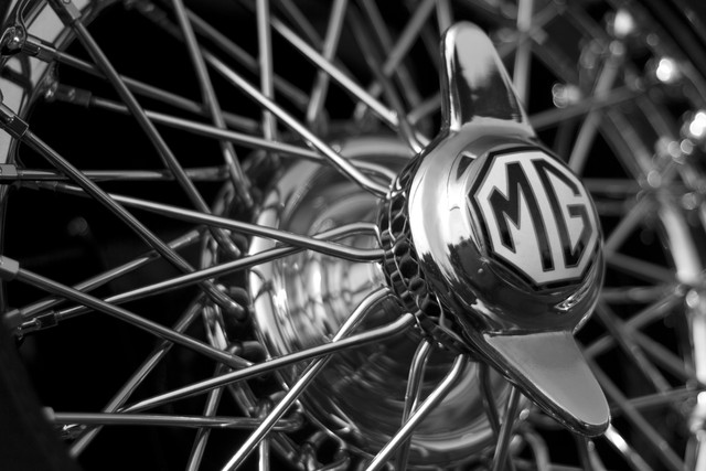
What Works: First, the B&W conversion does wonders for this shot - the change is subtle, but almost vital (mouseover the image for the color version). The lines and curves that intermingle in this shot really give the viewer plenty to look at without ever getting stuck in any one place. Additionally, the placement of the center hub with the MG logo on it kind of breaks some rules, but does it very successfully I think - I will discuss further in a bit.
What Doesn't Work: There is a reflection on the middle-left that I only noticed just now. I'm actually debating another run through processing this - a friend showed me another version that I liked and want to attempt - so I may clone it out then. Also, the right side of the MG logo is just ever so slightly starting to blur due to the depth of field selected - but not enough to be a problem in my opinion.
So what was that about breaking rules?
Well, take a look at the line the face of the logo directs your eyes. Normally, that kind of angle would direct your gaze towards the right and out of the frame. I shared this shot on a forum and one member asked why I selected the placement of the logo to the right and not the left.
First off, take a look at the spokes behind the center hub with the logo - because of the DoF, they're blurred - and very nicely in my opinion. I liked that blur. However, if I put the hub on the right side of the frame, there was very little of the spokes in focus to the left, and their intricate pattern is just as vital to the shot as the logo. I looked at it like that through the viewfinder, but instantly nixed the idea. Plus, if the logo were on the left, the shot would have had to be more straight on to keep the wheel filling the frame, and that would have produced an entirely different look.
Getting back to the line that the face of the logo directs your eyes - normally it would be a bad idea to have something direct your viewer's gaze out of the frame... the whole point of photography is to get them to look at your photo. Luckily, in this case, the far edge of the wheel is at the edge of the frame and naturally produces a shift in your visual path. At least for me, my eyes hit that edge of the wheel and then turn and follow it up and around the top of the frame - eventually making my way back to the spokes that are in focus on the left side of the frame. From there, they wander around and eventually end up back at the center hug and logo. Surprisingly, this works even though the entire wheel is not in the frame but broken at the top and bottom - I think it is because our mind knows the shape that is there and fills in the missing parts for us.
I don't know - maybe I'm talking a load of rubbish (to steal a phrase from the British... since this is a British car after all), but give it a shot. Let your eyes wander around the frame and see where the lines lead you.
Drop me a comment and let me know what you think and whether your visual path is different through this photo.
Thanks for viewing.
- Bill
PS: Normally I refrain from getting that detailed about how my own visual path flows through a photograph - mainly because I want each viewer to find his or her own visual path through my photos. However, in this case, it really served a purpose to explain how in this case the rules can be broken and yet still produce an engaging photograph.


Post new comment