PVGP 2011 (part 7)
ktuli — Wed, 08/24/2011 - 19:04
Ok - sorry for the lack of posts recently. I've been alternatively too busy or too tired or just a bit unmotivated, but I am forcing myself to try and get back to more regular posts.
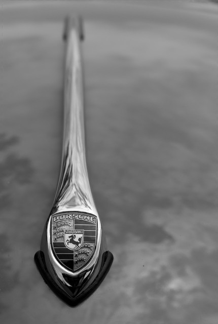
This year's marque was Porsche, so there were plenty to shoot. I liked this hood ornament and thought the shallow depth of field would be nice as the ornament swept back along the hood of the car.
I took a couple shots of this hood, and eventually liked this offset version the best - I tried a perfectly centered version, and it just didn't work for me.
If you mouse over the shot, you will get to see the original, and you can get a feel for the post production edits that I did to make this shot a bit nicer. First, I rotated slightly clockwise to get the hood ornament perfectly vertical - it had a very subtle tilt before, but it was enough that I could see it. Next, I used some content aware fills to fill in any gaps left by the rotation (I could have also cropped to take care of them) and to remove the bright reflection from the hood as it was very distracting.
Finally (and obviously), I converted to black and white. For the most part, this is another shot (like the MG Wheel) that really doesn't change that drastically going to black and white, but the effect really helps to clean things up and make the shot really stand out nicely. In particular, the black and white treatment helped to make the Porsche emblem much more readable than it was in the color version. By removing the color and highlighting the contrast, it made that feature much more prominent in the frame.
Technical Data: Canon EOS 7D, Canon EF 50mm f/1.8 II, 1/1000 at f/5. ISO 100. 2011 Pittsburgh Vintage Grand Prix, Pittsburgh, PA. Raw conversion, modifications, and B&W conversion in Photoshop CS5 (mouseover for original).
Thanks for stopping by.
- Bill


I think I like the original better. The bluish color of the metal is really neat.
The B&W version has greater detail in the crest. I prefer it to the color version in which the detail of the crest is somewhat overexposed.
Post new comment